Search the Community
Showing results for tags 'ui'.
-
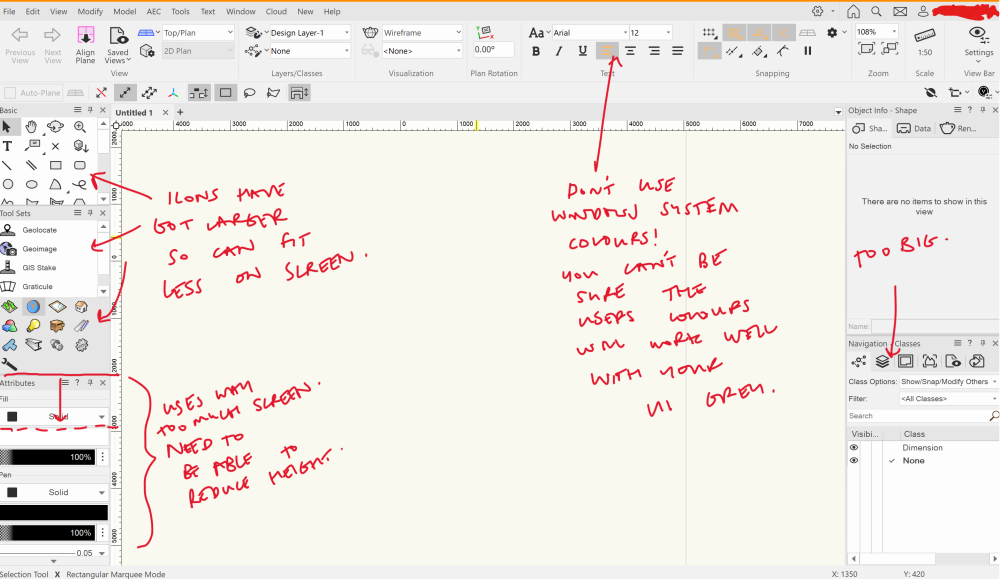
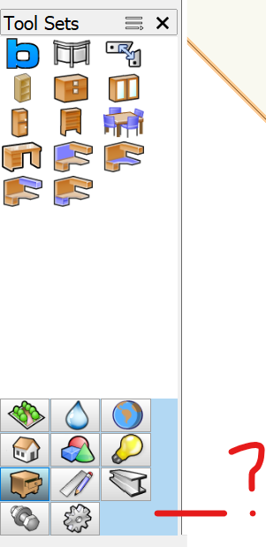
Ok so there was a previous 'UI Overhaul' post from a while back. But it seems to suggest, frankly, exactly the opposite of what I would like to see, so I can't upvote it. Therefore, new request time.. I've also posted this feedback in the '2024 - Icons' thread, but again not focused on what I want to specifically raise, which is about UI scaling and in particular icon sizes. We really need more customisability in icon sizes and scaling for different UIs. This was an issue before, but has got worse jumping from vwx 2023 to 2024. As you can see in screenshot below, on my laptop display (14", 2.8k, 16:10 aspect ratio), the icons and attributes take up too much screen real estate, and make it difficult to navigate to the various tools. This is always tricky to manage on laptops, however what I don't understand is why it has just been made worse. Ideally there should be a 'compact' mode for icons. Also, the 'attributes' part of the UI is really baggy compared to the rest of the tools and icons, and should be able to be made much more compact. Personally I'm also not a fan of the change in colours of the icons, which I find makes them harder to differentiate at a glance than they used to be, but this is more of a secondary concern. It would probably make everybody happy if an option was made available for black and white icons, or colour icons.
-
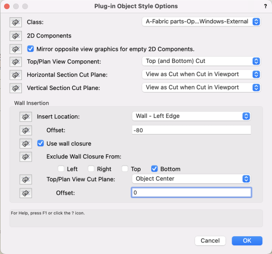
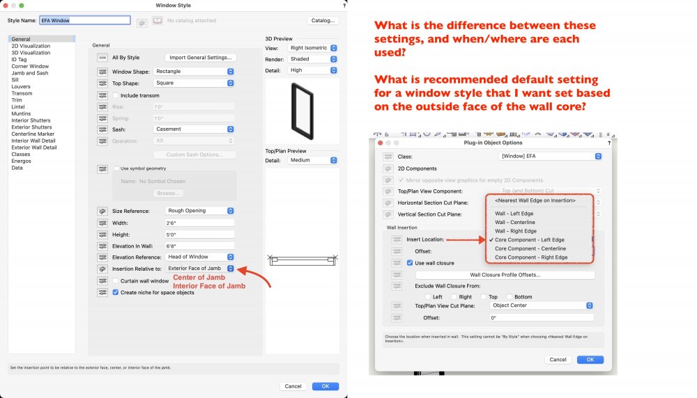
It took me a lot of messing about to get the new wall closure feature working properly. This is partly because wall closures necessarily have a complex relationship with walls but I think the main problem was that Plug-in Options are tucked away in a contextual menu. And many of the problems I see people having with wall closures (and plug-in object offsets) also relates to the discoverability of Plug-in Options. I've even seen people say they haven't seen the Plug-in Options window before. Plug-in Options are quite a bit more important now that they include wall insertion and wall closure options. Indeed equally important as Settings. I think there's a simple fix for this: every single plug-in object should have a "Plug-in Options..." button in the object Info palette. And if the plug-in has a Style dropdown menu in the OIP, that also needs a "Edit Style Plug-in Options..." option. Examples of people having problems due to this lack of discoverability : https://forum.vectorworks.net/index.php?/topic/65619-ability-to-control-where-a-windowdoor-is-offset-from-in-a-wall/#comment-415277 https://forum.vectorworks.net/index.php?/topic/87667-2022-wall-component-modeling/#comment-405066 https://forum.vectorworks.net/index.php?/topic/87703-any-luck-with-win-door-in-2022/ https://forum.vectorworks.net/index.php?/topic/102011-door-tooloffset-gone/ https://forum.vectorworks.net/index.php?/topic/103702-problem-with-doors-in-v2022/#comment-452794
- 10 replies
-
- 7
-

-
Navigation palette fails to refresh when switching between files
StefanoT posted a question in Troubleshooting
When working on more than one file, it happens to us that navigation palette contents (e.g. layers, classes etc) fails to update/change when switching from one file to another. Let’s say we are working on file “A”: after switching to file “B”, leaving “A” open, navigation palette keeps showing “file A” content while “file B” is active. This seems recurrent in VW2024 (macOS Sonoma), more than it was before. Anyone else experiencing this?- 3 replies
-
- 1
-

-
- navigation palette
- ui
-
(and 1 more)
Tagged with:
-
Batch Convert UI needs an overhaul
shorter posted a question in Wishlist - Feature and Content Requests
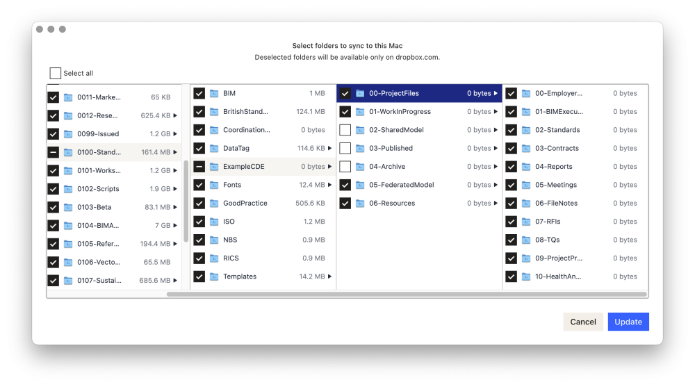
The batch convert dialog needs an overhaul and behave more like a cloud server interface, allowing you to choose which folders you want to convert and which are to remain as-is. Was reminded of this need after batch converting a load of projects on One Drive where, like Dropbox, etc, you can de-select folders to sync and therefore remove from the batch conversion process, like 'SS' or Superseded folders and existing Archives. For example, my Dropbox folder structure allows me to deselect folders that I do not want to sync.... Thanks-
- 1
-

-
- batch convert
- archive
-
(and 1 more)
Tagged with:
-
I'd like a new command: File > Open Recent > Clear Menu VE-102237 Important comment from Andy: Now that 2023 has a Home Screen, this command should also clear out the recent files seen there. Particularly since the Home Screen displays thumbnails, this can be an issue when screen sharing versus trying to protect content protected under NDA. Some companies (D*sney/M*rvel for example) are very strict. Even file names could give away sensitive info...
-
Search field for the New Class window
Christiaan posted a question in Wishlist - Feature and Content Requests
-
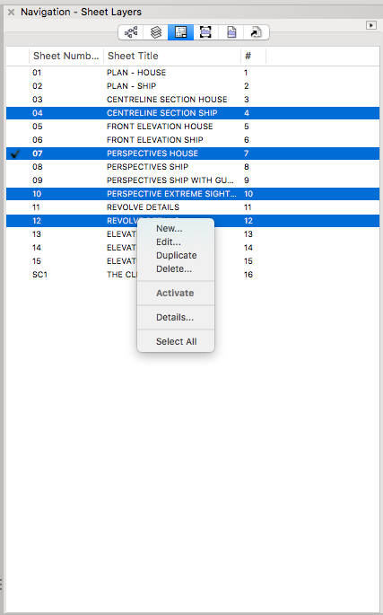
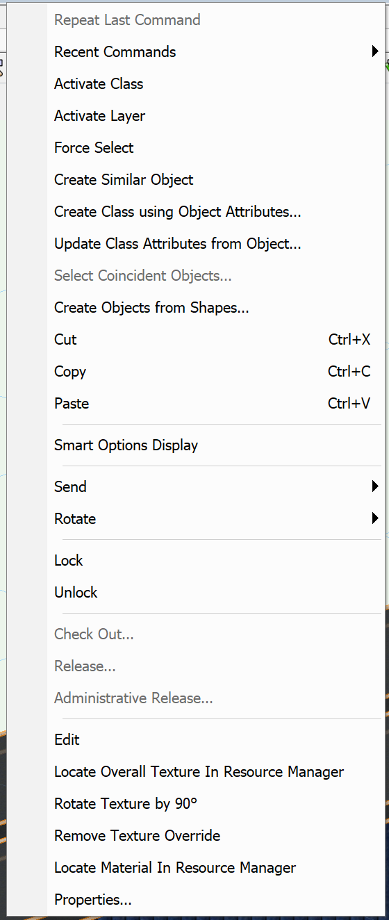
I would like two things to be added to the Navigation Palette to make it easier/more intuitive to updated multiple sheet layer viewports across multiple sheets at the same time. My wishes are - 1) to add a sheet number column to the Navigation-Viewports tab so you can see and sort the Viewports by sheet layer. 2) add an "Update Viewports" option to the right click contextual menu on the Navigation-Sheet Layer tab so I can select multiple sheet layers and right click to update their viewports (the current menu is shown in the screen shot below). Kevin
-
Hi all, We all use VW differently and as obvious we have our UIs differently from one another, i was kinda looking into new ideas on how to improve mine... I've tried to optimise to more real estate on the screen, as i mostly use shortcuts. I also use M as shortcut for the Unconstrain dimension tool and W for the magic wand Left side of the screen Right side of the screen Top right corner - Quick options
-
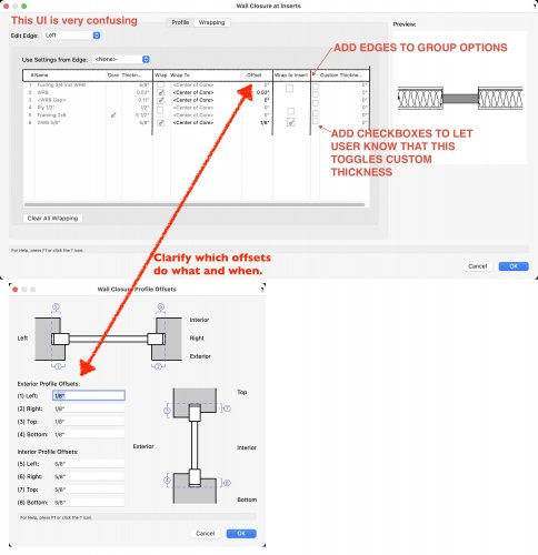
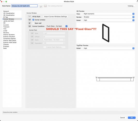
As a followup to this thread (https://forum.vectorworks.net/index.php?/topic/87667-2022-wall-component-modeling/) about how to set up Wall Component Wrapping (for which @Matt Panzer has provided great feedback), I have some suggestions/questions regarding improvements to the UI that would make this all a bit less confusing. There are settings that are similarly named, but do different things (?) that you get to in different places, unlabeled columns that need to be checked, etc. I'm guessing that after I've used these for a while I'll get the hang of it, but starting out it is incredibly confusing, at least to me. Other users might have an easier time of it. I'm attaching some annotated screenshots that offer a window into my confusion. As a semi-related bonus, there's an inconsistency in the corner window settings. Everywhere else, there is an option for "Fixed Glass", but at the corner window this is called "Fixed Glass". Are these supposed to be the same?
-
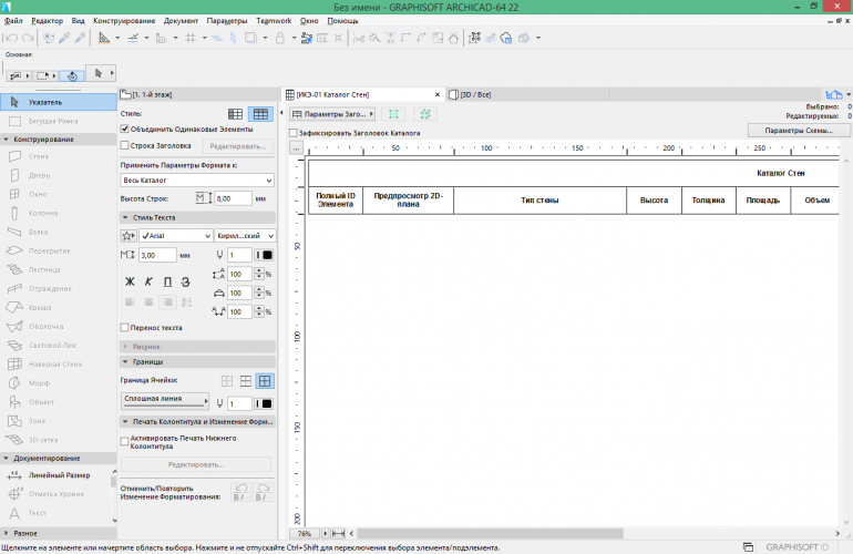
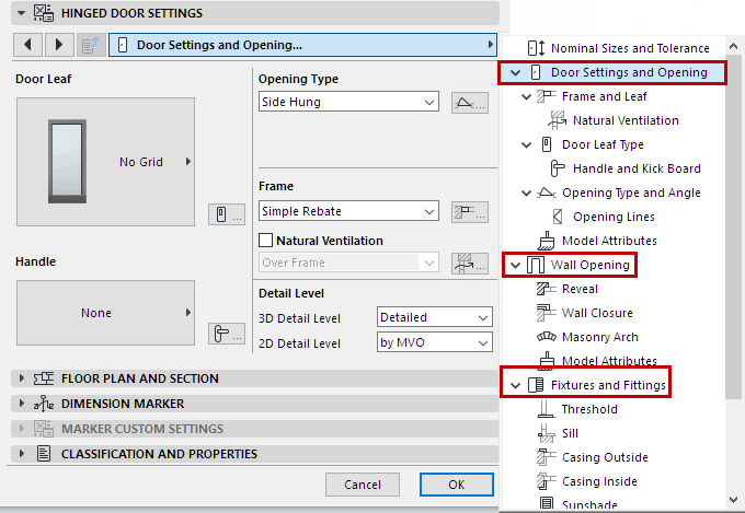
Vectorworks has the object info palette to 'quickly' see and edit the info of a object. But for a lot of tools the information is an extreme long list of text and numbers. Making it impossible to find the setting or information you need. For example the window tool has a 3 (!!) page long list of text and numbers. I know that you can collapse part of the information but it is still hard to find anything. My whish is that VW redesign the object info palette to making it visual easier to find the information you need. A great example of how this can be improved can be seen at Archicad info box. They use icons so you can easily separate the information and find what you are looking for faster. If the information is to much they use graphical pleasing popups. Some examples of the horror in Vectorworks: How Archicad does this small edits in the info box Big edits in pop-up with nice visuals Those icons on the right is something I wish the object info palette of VW had, ping @Stephan Moenninghoff
-
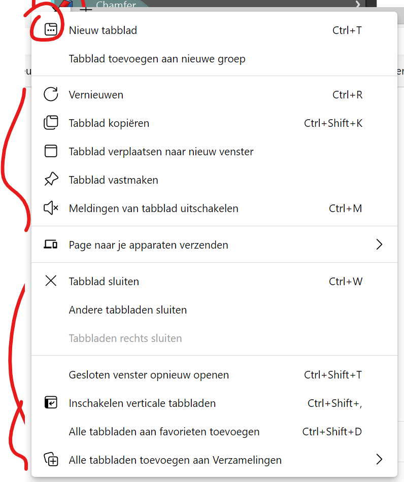
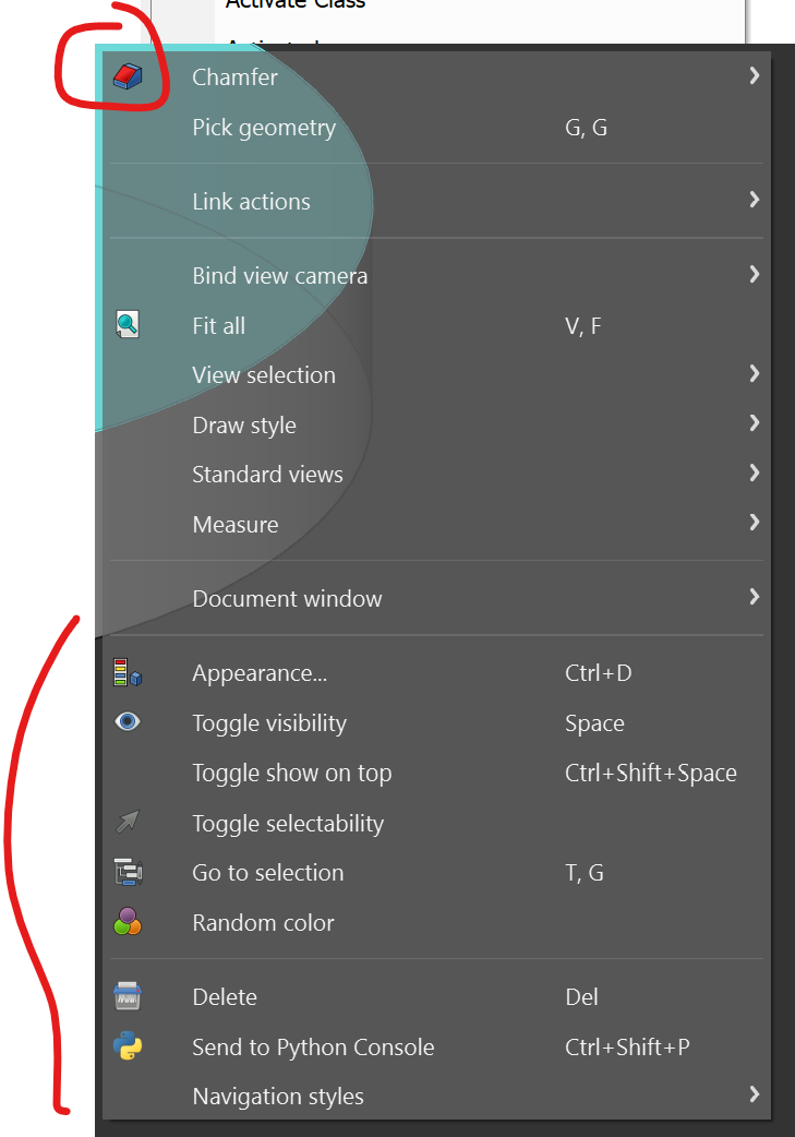
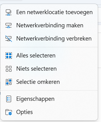
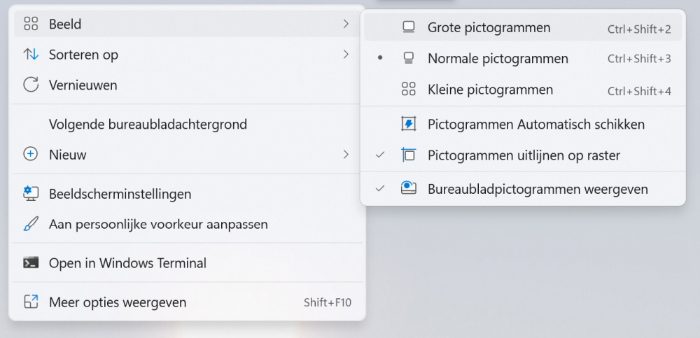
Right now the right click (context) menu is text only. Making it sometimes hard to find the option you need. Adding icons would help recognizing the tool you need. The space is already there! but where are the icons? Ping @Stephan Moenninghoff How it looks in Vectorworks: Compared to Windows 11, Edge Browser and Freecad:
-
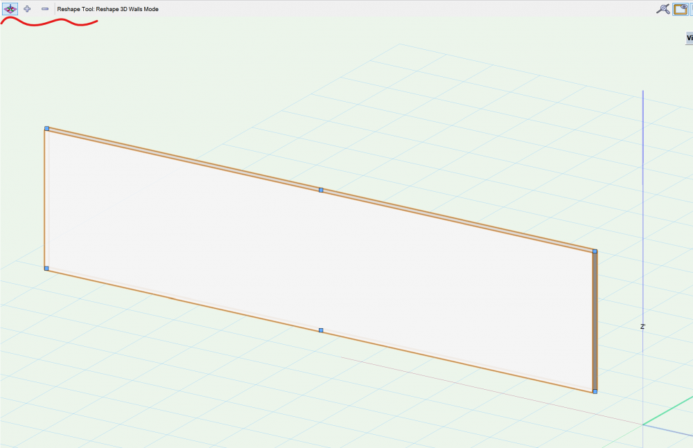
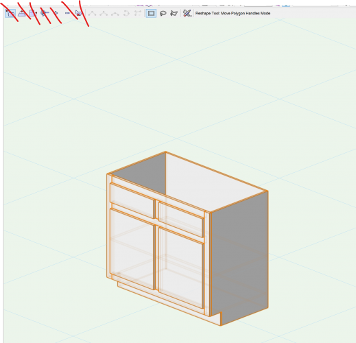
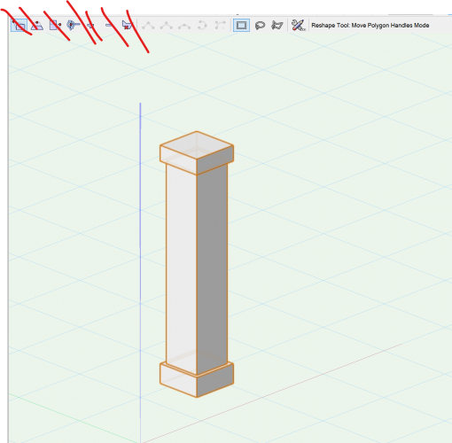
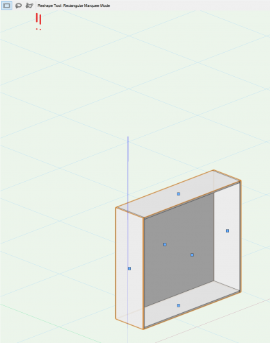
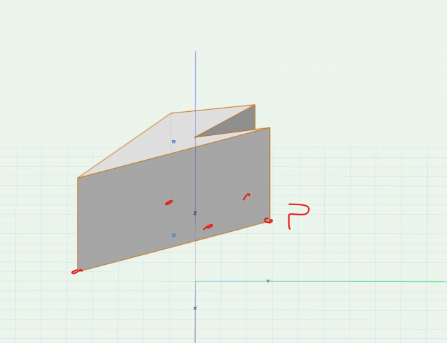
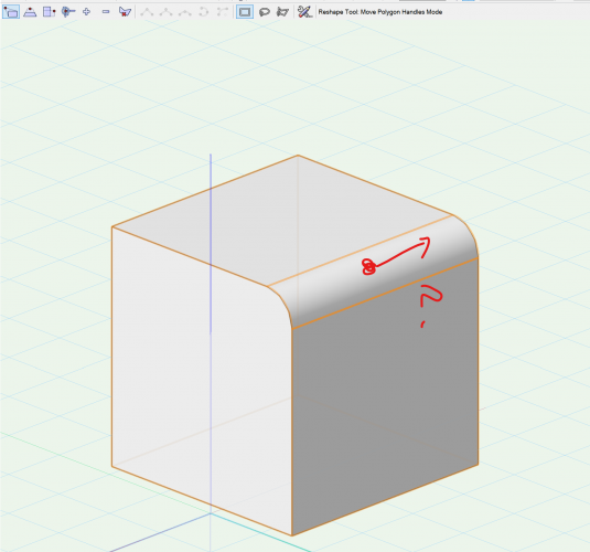
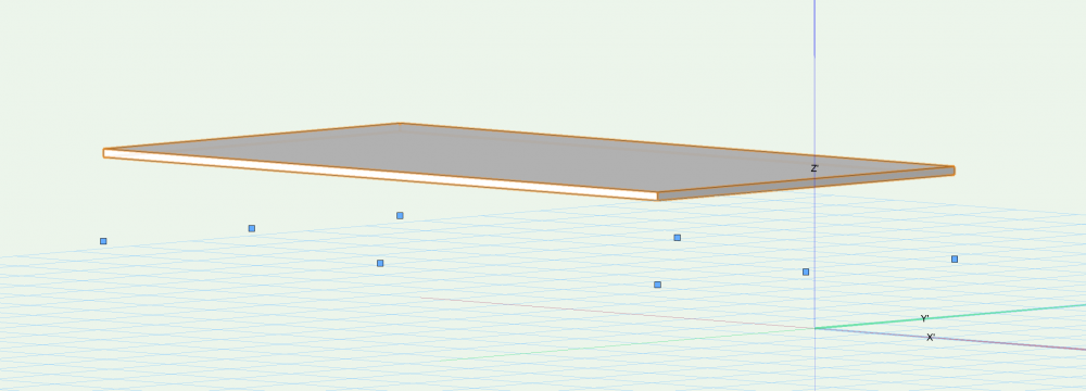
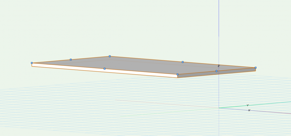
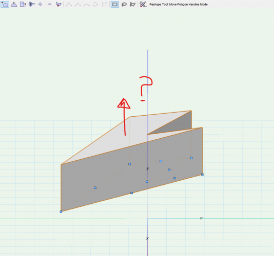
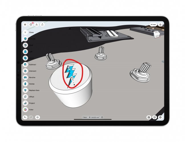
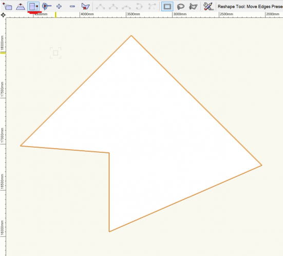
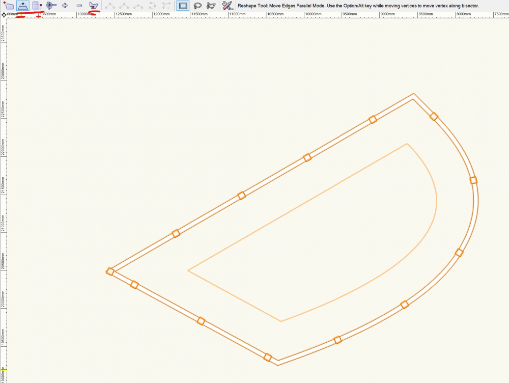
The Reshape Tool is a great function to visual reshape a object. Unfortunately it's implementation in VW is non uniform. A lot of times when I activate the Reshape tool on a object I see all the buttons (move polygon point, move edge etc.) but none of them are useful for the object. In my opinion a lot of tools missing the reshape function. I think VW should make a decision: - Implement the reshape capabilities for those object, or don't make the reshape tool active when only selecting a non compactible object. - Only show the reshape buttons (move polygon point, move edge etc.) that are useful for that particular object. Some examples: Reshape Custom Cabinet is a great example it only shows the buttons that are useful. But compared to reshape the base cabinet where all the reshape buttons are shown but none of them are working... Reshape floating floor (z=1000mm) shows control points on the plane, compared to reshaping a floating slab where the control points are correct IMHO. Reshape Column, all buttons shown none working Reshape Pillar shows control points for editing the shape but none for the height. Compared to reshaping a extrude where you can controll the height but not the shape Reshape a wall missing tools. Would be useful to have move by edge option Reshaping 3d modeling tools can be activated but none of them are working. For example if I activate the reshape tool on a object where I recently made fillet edge it would be usefull to use control points to edit the fillet radius This list can go on and on. Please take action and make VW a more uniform experience. Make the control points more visual instead of boxes For example show arrows for extrusion and edit of fillet edge etc. like with the Shapr3D App
-
- 2
-

-
- reshape tool
- reshape
-
(and 1 more)
Tagged with:
-
Perhaps we can have a dedicated topic to report UI issues? Here is a list of what I found so far in VW2022: Space tool - Pick Up atributes and Apply use the same icon. Suggestion to use a bucket icon for 'Apply Attributes' Tool Sets shows blue background color, should be grey IMHO Reshape Tool shows tools that are not available, or don't have any effect for the selected object.. For example with railing most of the icons are useless Also the new preserve area don’t work with shapes other than squares, so why show it everywhere?
-
I'd like the ability to restrict scrolling of the Navigation Palette to be vertical only. I use an Apple Magic Mouse and I'll often accidentally scroll the first three columns out of view. If I want to see some text to the right I'd rather have to widen the palette (or optionally turn sideways scrolling back on). VE-102569
- 1 reply
-
- 5
-

-
- navigation palette
- ui
-
(and 3 more)
Tagged with:
-
Interface: the single unified window
Christiaan posted a question in Wishlist - Feature and Content Requests
I'd really like VectorWorks to move to a single unified tabbed window interface, along similar lines of Apple's Pro Apps series such as Aperture and Logic (screenshots attached below) Here's a review of Logic, which only recently gained the unified interface (the reviewer agrees with me): http://www.macworld.com/weblogs/creative/2007/09/logic-studio-8/ One of the things I really dislike about many applications is their reliance on floating palettes, toolbars and panes. Maybe these were useful at some time in some situation but I've never found them useful; just a pain in the ass to manage. But that's just me and I'm quite organised about the way I use VectorWorks. When I see how other less experienced or less organised people manage their palettes it just blows me away how inefficient the whole paradigm is. Maybe it isn't as much of an issue on Windows because Windows has "dockable" toolbars, but I think a unified window would be advantageous to Windows users too. Can anyone explain why a non-unified interface is a good thing, for instance, in light of such interface ideas as tabbed windows and tear-able palettes? -
Hi All Apologies if I've missed something glaringly obvious (I've searched the forums and can't seem to find an answer) i'm wanting to create a dialog where the user can still interact with the OIP and the rest of VW whilst said dialog is open and running. Effectively I want a dialog window that is open and on top, but still allows users to interact with the rest of VW. I'm wondering if I might be able to accomplish this with SetLayoutOption() however for the life of me, I can't find a list of options and values I can pass to this command. Is there a convenient list of said options somewhere? Or can anyone suggest another way to accomplish this?
-
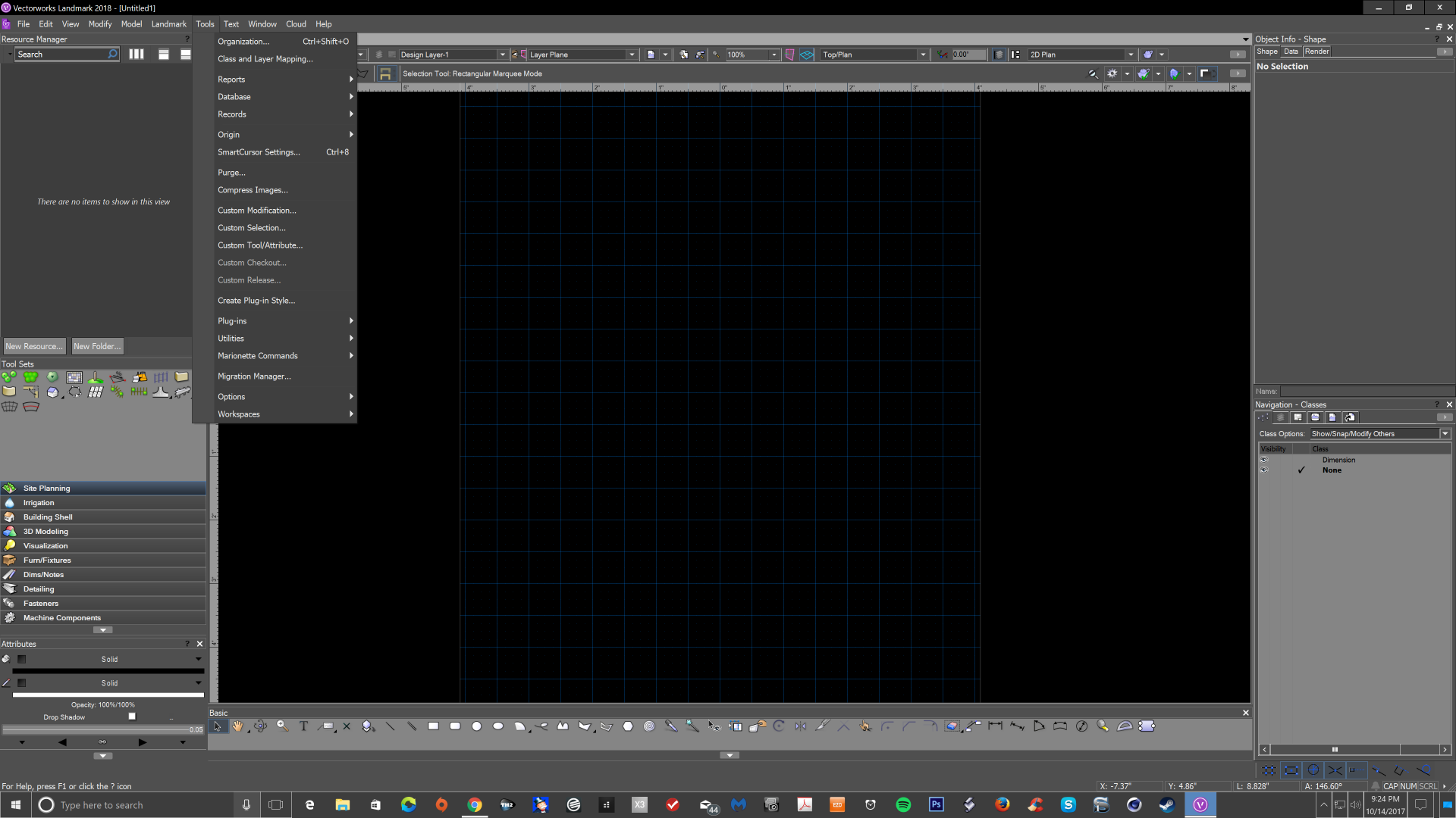
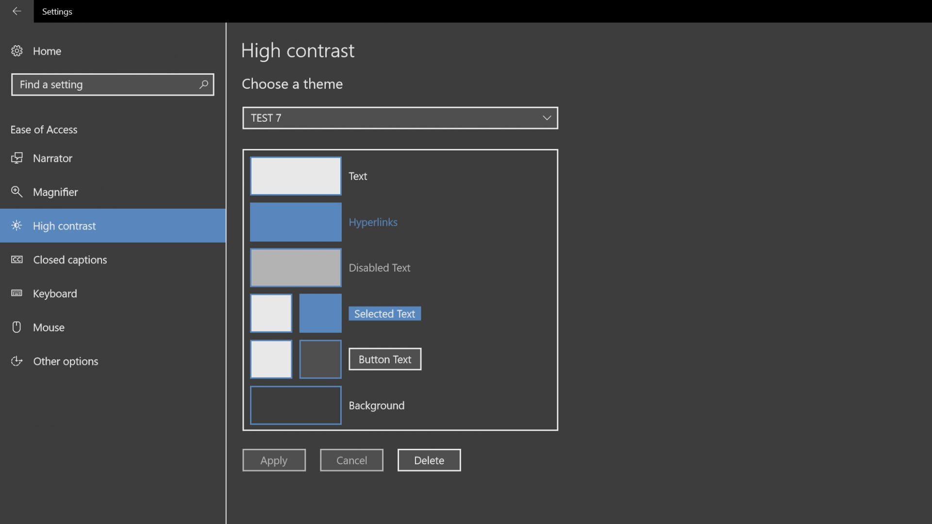
Hi, I have read a few topics regarding a dark interface for Vectorworks in windows 10. This can be done using the ease of access high contrast option in the personalize section of windows. Its a pretty good option for those of us that may have aging eyes that really have a hard time looking at a nearly white interface all day. It may take a few tries to get what you want but this is a good option to try until vectorworks comes out with an interface overhaul. You do not need to patch any files, just find the colors you like and save as a theme. Do not let the built in preset themes scare you as they are awful, just change the color to what you like. Hope this saves a few eyes. I would be glad to hear about any better options people may have.
-
Hello everyone, Any idea/suggestion on how (if) we could turn on the green progress bar for commands and operations (lower right corner)? We're experiencing inconsistent behaviour (VW2020 Architect latest version, localised and international): progress bar is always showing for backup autosave, but not for other complex operations (updating walls, spaces etc.). It seems to us this behaviour could be hardware or install related: progress bar is showing in a VW Mac Book Pro (Late 2010, vram lower than recommended specs) but neither on iMac (Late 2012, vram lower than recommended specs) nor on MacBookPro (2019, vram higher than recommended specs). Not sure if there is any setting/preference we could change. Since at the office we do work with detailed and sometimes complex files not having a progress bar is very frustrating: most of the times we're struggling understanding if VW is freezing or not, with no way to understand if a "force quit" (rather than waiting for an unpredictable time) is the right thing to do. Any suggestion is more than welcome.
-

Toggle display of User Account Info in 2020?
Jacob@tangably.com posted a topic in General Discussion
Is there any way to turn this off or hide it? The information that displays is incorrect and does not seem to update in relation to my Service Select Information -
The "More" "Fewer" choices method for defining the database criteria arguments is pretty terrible. Most notably when you are trying to remove an argument. The "Fewer Choices" does not allow you to select which criteria you would like to remove. So if you have 4 and want to remove the top one, you have to erase it all and rebuild. "More" and "Fewer" should be replaced by a + button at the bottom of the list, and 'X' buttons by each of the existing criteria.
-
UI / UX Worksheet Formatting
Tom Klaber posted a question in Wishlist - Feature and Content Requests
I am sure this must have been requested in the past, but I think the cell formatting options should be brought out of the menu and simply appear as a tool bars on the editor - they way they do in Excel, Word, this forum. Have to right click or go to the format menu everytime I want to change an justification or font setting is supper time-consuming. -
It would be nice if palettes could have multiple instances. This way you could, for example, display your list of classes in one instance and your list of layers in another. Or you could show the shape tab of the OIP and the render tab at the same time.
-
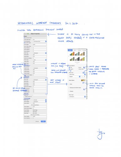
Hi all, Interface seems to be one of my favourite forum topics. This is a conversation I am having with my local distributor. I would consider myself a master user of the app, and I am by no means asking for a dumbing down of the software. What I am asking VWI for is to start reviewing the usability and legibility of the tool. I love the new features that are added from year to year, but I feel that features are being added without proper consideration to layout and interface design. Some examples of what I believe poor interface/usability are - : The new titleblock tool (too many front facing options), The slab tool (editing is no where near a s simple as the Floor command object), Rr the structural member tool (confusing in layout and how it relates to Framing Member and Columns Tools). I may go into these at a later date, but for now a perfect example is the Pilaster object's preferences dialogue window (See my attached markup below comparing the pilaster object with an app that I believe uses better design technique in this area). I would suggest with some input from a inclusive design consultant, and applying simple graphic / UI design techniques Vectorworks could bring more order (and approachability/usability) to an app that year by year becomes more laden with long lists of parameters in dialogue and palettes. Yes, with the complexity of modern architecture, we need more settings. But the settings should be as simple as possible to comprehend quickly. Deeper settings can be nested and revealed as required. And with the use of styles, the more complex settings are often not required to be seen most of the time. What do you think? Cheers.
- 13 replies
-
UI/UX_Streamlined User Style Selection
Tom Klaber posted a question in Wishlist - Feature and Content Requests
When you want to change the style of a wall - you select the wall then go to the style dropdown menu, then half to select replace, then you have to select the style, and then you have to select the replacement control line. This should be streamlined. It kills me that I have a dropdown list, that I have to select "Replace" only to be brought to a new dropdown list. At VERY least, that dropdown list should contain the active styles in the document. That would cut out 2 steps right there - select the style from the list - and go right into the control line dialog.


