This is just a small thing but it gives me a headache each time I deal with it because what it visually suggests is the opposite to what it actually means.
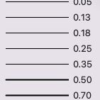
Here, it looks like it's indicating a reference point on the interface between the brick & plaster layers, but it actually is indicating a reference point on the interface between the brick & insulation layers:
Here, it looks like it's indicating a reference point on the interface between the brick & insulation layers, but it actually is indicating a reference point on the interface between the brick & plaster layers:
The reason the first example suggests the reference is between the brick & plaster is that mentally I extend the line like this:
Something like this would be less ambiguous
Don't really expect that this will be fixed in my lifetime, just wanted to get it off my chest.
You can post now and register later.
If you have an account, sign in now to post with your account.
Note: Your post will require moderator approval before it will be visible.


Question
line-weight
This is just a small thing but it gives me a headache each time I deal with it because what it visually suggests is the opposite to what it actually means.
Here, it looks like it's indicating a reference point on the interface between the brick & plaster layers, but it actually is indicating a reference point on the interface between the brick & insulation layers:
Here, it looks like it's indicating a reference point on the interface between the brick & insulation layers, but it actually is indicating a reference point on the interface between the brick & plaster layers:
The reason the first example suggests the reference is between the brick & plaster is that mentally I extend the line like this:
Something like this would be less ambiguous
Don't really expect that this will be fixed in my lifetime, just wanted to get it off my chest.
Edited by line-weightLink to comment
12 answers to this question
Recommended Posts
Join the conversation
You can post now and register later. If you have an account, sign in now to post with your account.
Note: Your post will require moderator approval before it will be visible.