Search the Community
Showing results for tags 'interface'.
-
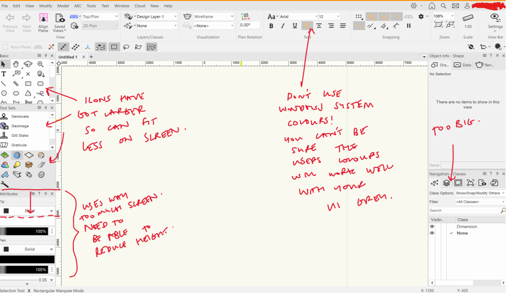
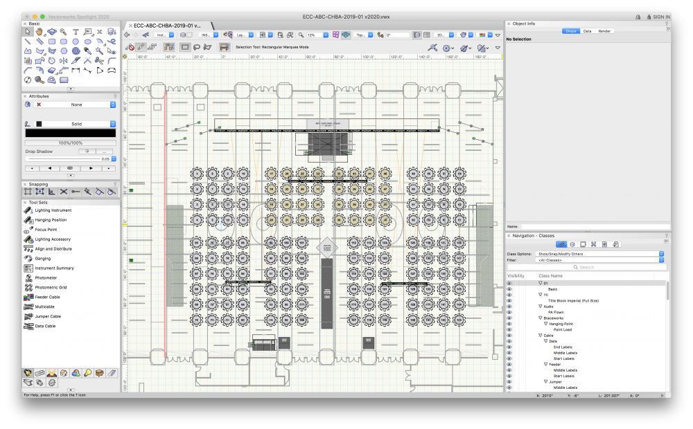
Ok so there was a previous 'UI Overhaul' post from a while back. But it seems to suggest, frankly, exactly the opposite of what I would like to see, so I can't upvote it. Therefore, new request time.. I've also posted this feedback in the '2024 - Icons' thread, but again not focused on what I want to specifically raise, which is about UI scaling and in particular icon sizes. We really need more customisability in icon sizes and scaling for different UIs. This was an issue before, but has got worse jumping from vwx 2023 to 2024. As you can see in screenshot below, on my laptop display (14", 2.8k, 16:10 aspect ratio), the icons and attributes take up too much screen real estate, and make it difficult to navigate to the various tools. This is always tricky to manage on laptops, however what I don't understand is why it has just been made worse. Ideally there should be a 'compact' mode for icons. Also, the 'attributes' part of the UI is really baggy compared to the rest of the tools and icons, and should be able to be made much more compact. Personally I'm also not a fan of the change in colours of the icons, which I find makes them harder to differentiate at a glance than they used to be, but this is more of a secondary concern. It would probably make everybody happy if an option was made available for black and white icons, or colour icons.
-
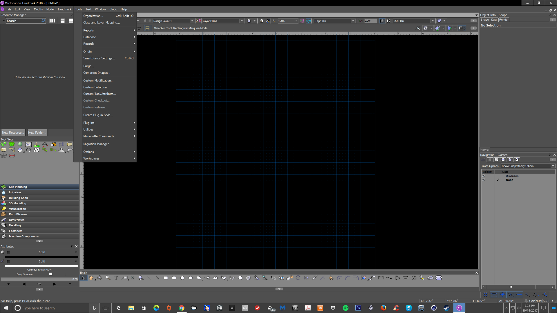
So here's the problem: The menu options for class, layer, and working plane grey out. Here's the issue: I can't create the problem... it just happens. SOMEtimes, on SOME files. I haven't been able to pinpoint a command or action the precedes the issue. Our company has multiple licenses so I tried hopping onto a different license and had the same issue. It's likely not my computer because it happens on both of my work computers (one is brand new within the last 6 weeks.) Has anyone else had this happen? Know any fixes? Currently my fix is to Save, close the project, reopen the project (problem soved)... and repeat as necessary. It's more annoying than anything... not "Show Stopping". Contacted Customer Support a few weeks ago and haven't heard anything. 2023 Vectorworks Design Suite, Renderworks, Braceworks - SP3 (Also happened on SP2 before I updated) Computer 1: 2017 Macbook Pro i7 Ventura 13.2.1 16GB RAM Computer 2: 2022 Mac Studio M1 Ultra Ventura 13.2.1 64GB RAM
-
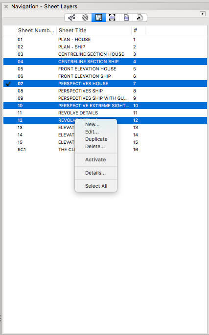
I would like two things to be added to the Navigation Palette to make it easier/more intuitive to updated multiple sheet layer viewports across multiple sheets at the same time. My wishes are - 1) to add a sheet number column to the Navigation-Viewports tab so you can see and sort the Viewports by sheet layer. 2) add an "Update Viewports" option to the right click contextual menu on the Navigation-Sheet Layer tab so I can select multiple sheet layers and right click to update their viewports (the current menu is shown in the screen shot below). Kevin
-
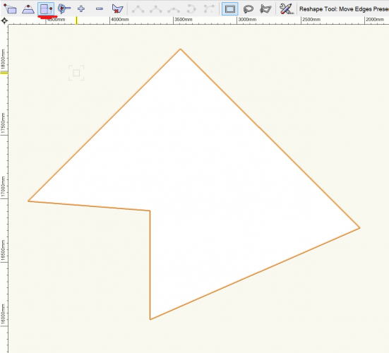
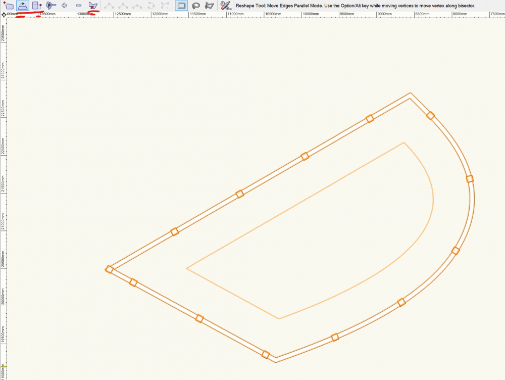
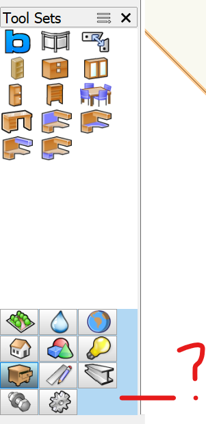
Perhaps we can have a dedicated topic to report UI issues? Here is a list of what I found so far in VW2022: Space tool - Pick Up atributes and Apply use the same icon. Suggestion to use a bucket icon for 'Apply Attributes' Tool Sets shows blue background color, should be grey IMHO Reshape Tool shows tools that are not available, or don't have any effect for the selected object.. For example with railing most of the icons are useless Also the new preserve area don’t work with shapes other than squares, so why show it everywhere?
-
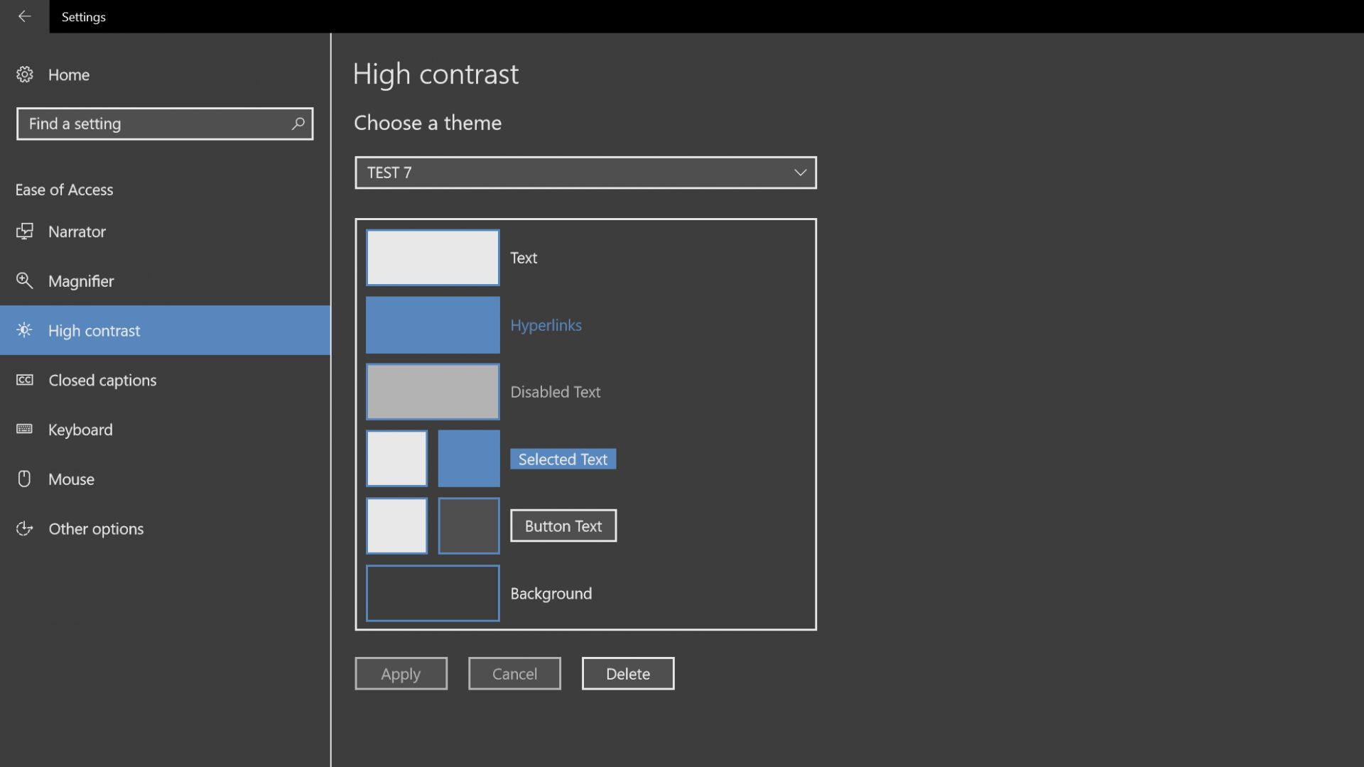
Hi, I have read a few topics regarding a dark interface for Vectorworks in windows 10. This can be done using the ease of access high contrast option in the personalize section of windows. Its a pretty good option for those of us that may have aging eyes that really have a hard time looking at a nearly white interface all day. It may take a few tries to get what you want but this is a good option to try until vectorworks comes out with an interface overhaul. You do not need to patch any files, just find the colors you like and save as a theme. Do not let the built in preset themes scare you as they are awful, just change the color to what you like. Hope this saves a few eyes. I would be glad to hear about any better options people may have.
-
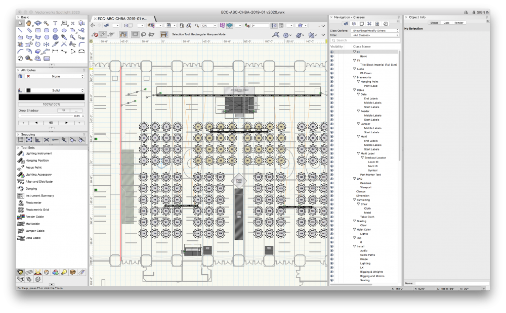
Hello engineers, VWX has come quite a way since '16 when we started using it in our event industry. REQUEST: My main wishlist item is the ability to separate the Navigation panel tabs into their own palettes. A user could then position the Classes, Design Layers, Sheet Layers, Viewports, Saved Views as their own windows within a workspace, or keep them in the Navigation Panel as tabs. The user could still independently select the Selection Mode for Layers and Classes ("Show/Snap/Modify"). The user could still independently show/hide/ghost Layers and Classes. RATIONALE: I run my workspace in two separate styles depending on the complexity of the event (mostly defined by number of total classes/layers) In both workspace setups, it is essential to switch between Classes AND Layers many, many times during the creation of an event. It is also critical to jump to pre-saved views to visualize (and often, reposition items in 3D space) to view the changes that are made to the overall Top Plan. Finally, during post-production, it is critical to layout and add different sets of annotations and completely different Sheet Layers with unique Viewports for different departments (tech, lighting, AV, client, venue/service, rigging company) This takes significant amounts of time due to sheet layers respecting the Classes and Layers of items that are placed on them Sheet layers are the best (only?) way to deliver final documents to clients, suppliers, partners, and other agencies Annotations, or Viewport layer crop adjustments, already take a significant amount of time to edit due to how VWX loads the viewports. Missing an annotation because it is in the wrong design layer requires the entire process to be repeated. Changes to annotations, viewports, are a significant time chunk and always seem to be changed by client request during the design phase. "Force Select" (Right-click, Force Select) adds double the amount of clicks in the design phase. I am not able to hide layers to avoid extra clicks, as many layers actually hold information that is vital to the planning phase. (Rigging Beams, for example) I am not able to regularly use the "Select/Snap/Modify Others" selection mode as an option, in many cases, mainly due to the different Design Layers that are required to generate an event floorplan, and not wanting to affect those layers or classes during the design phase. (selecting lecterns, stage furniture/seating, for example, without selecting the Stage Decks underneath) Edit: In our case, we are not doing this 5-10 times a year for big shows, or re-using plots and tweaking them venue-to-venue. In 2019, we (I) created, revised, and updated 104-ish unique floorplans for our clients. Each usage of "Force Select", the process that I use to select discrete items on a floor plan to avoid the Classes/Layers panels, takes approx 5-6s depending on the complexity of the floorplan, every time. Considering I use the function maybe 300, 400 times per session: that is 300 * 5 = 1500, 1500/60 = 25 minutes of wasted time simply to select and modify the proper items on a basic floorplan. Even at a extrapolation of using that function daily for 3 days a week, for 52 weeks a year, it ends up at 15,600 minutes or 260hours a year spent just clicking Force Select. PRECEDENTS/ANALOGUES: Adobe Illustrator uses "Artboards", and "Layers" as a way to show different exportable versions of the same artwork. The palettes are separable. Sketchup uses "Scenes", which can store "Layer" visibility. "Outliner" reflects the grouped component items within visible layers and allows for easy selection. The palettes are separable. EXAMPLE: EVENT is inside VENUE X for 2020 date. CLIENT requests a layout plot for their event tables, including tech tables, and bars, cruiser tables, registration desks. CLIENT also requires in-room renderings, room shots. VENUE requires staging, dimensions, and tables, with service pathways for catering, and minimum distances for emergency egress RIGGING COMPANY requires full tech plot, with LX fixtures, rigging and motor points, weight load labels, trussing, and any flown gear or decor items, and label legend. AV requires full tech plot with trussing, cable paths, projection and video with projection beams, audio line arrays and dispersion, power and staging areas, tables, dead case storage layout, and label legend. In this case, it makes sense to have many Design Layers to QUICKLY isolate different items for the Sheet Layers/Viewports that will eventually be Published INSTALL-AV (This layer may hold Spotlight projectors, tech tables, PTZ Camera hang points, FOH staging, LED Wall, speakers, decor elements, drape, everything the AV provider needs to install) INSTALL-TRUSS (I like to separate the Truss to quickly solo the layer during lighting fixture placement, other flown items) INSTALL-LX (Lighting Fixtures and Focus Points, special lighting-only truss or towers, hazers, fog, etc.) INSTALL-Venue (Carpeting, bars, seating, service pathways, drape or stage decks, anything the venue is installing) INSTALL-Rigging Vendor (Label Legend, fixture weights, rigging and motors/hoists, soca, cables, dimensions, decor, power drops or tie-in points) INSTALL-Client Dimensions (dimensions that will be shown to the client on their Sheet Layer) INSTALL-Tech Dimensions (dimensions that will be shown on tech layers) VENUE-Structure (the actual building, including walls, doors, windows, rigging beams or structural hang points, chandeliers, curtains, sconces, cable troughs, catwalks, power outlets, other BIM) VENUE-Ceiling (for easy OpenGL ISO views, as well as internal render views with ceiling and full lighting) In many cases, Classes are used across design layers. A good example would be Dimensions: as a user, I will always find the Dimensions for any Design Layer in the Dimensions class, as that's where VWX always defaults. Same with other plug-in items ("Truss", or "Hoists") which all have a default VWX layer that they end up in. I am already using many different work-arounds in my workflow that either reduce or outright skip VWX functionality that is good but not feasible to use on every plot. An example would be Hoist Labels, Cable Paths, Seating Layout, vertical truss or truss grid structures via the Insert Truss tool These tools require extra time to properly instantiate on plots. This time is mostly spent in the Object Info Palette, which I prefer to have as much visible as possible on the workspace to avoid scrolling or missing information because it is not visible in a smaller palette. CONCLUSION: If VWX enabled the Navigation Palette tabs to be their own palettes: organization becomes much faster to manage less reliance on "Force Select" as a main selection tool Saved Views become more feasible to use in a fast-paced design setting (ESPECIALLY with rotated top view) Design Layers and the interaction between Classes becomes twice as fast to manage imported CAD drawings with hundreds of Classes are easier to navigate and reassign to layers The relationship between Sheet Layers and Viewports becomes easier to edit The "Organization" applet becomes more relevant, and filters become more useful, because overall file organization is easier to deploy Users are not punished with excessive UI switching for properly separating different items to Design Layers
- 2 replies
-
- 1
-

-
- navigation
- quality of life
-
(and 3 more)
Tagged with:
-
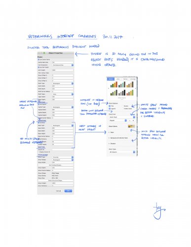
Hi all, Interface seems to be one of my favourite forum topics. This is a conversation I am having with my local distributor. I would consider myself a master user of the app, and I am by no means asking for a dumbing down of the software. What I am asking VWI for is to start reviewing the usability and legibility of the tool. I love the new features that are added from year to year, but I feel that features are being added without proper consideration to layout and interface design. Some examples of what I believe poor interface/usability are - : The new titleblock tool (too many front facing options), The slab tool (editing is no where near a s simple as the Floor command object), Rr the structural member tool (confusing in layout and how it relates to Framing Member and Columns Tools). I may go into these at a later date, but for now a perfect example is the Pilaster object's preferences dialogue window (See my attached markup below comparing the pilaster object with an app that I believe uses better design technique in this area). I would suggest with some input from a inclusive design consultant, and applying simple graphic / UI design techniques Vectorworks could bring more order (and approachability/usability) to an app that year by year becomes more laden with long lists of parameters in dialogue and palettes. Yes, with the complexity of modern architecture, we need more settings. But the settings should be as simple as possible to comprehend quickly. Deeper settings can be nested and revealed as required. And with the use of styles, the more complex settings are often not required to be seen most of the time. What do you think? Cheers.
- 13 replies


