Search the Community
Showing results for tags 'data visualisation'.
-
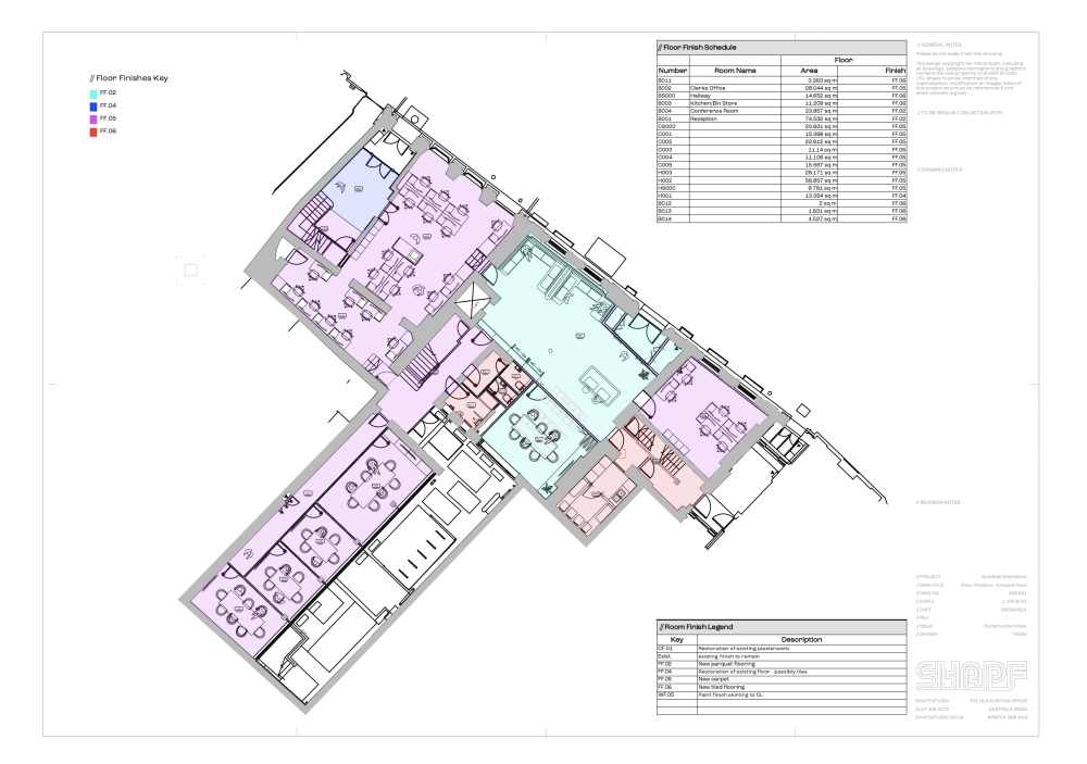
Hi there, I am new to using records, reports, worksheets and data visualisation. They seem great, but I cant seem to make them work together. If anyone can point me in the direction of a comprehensive course or tutorial detailing all these (separately or together) I would very much appreciate it. In the meantime, is there a way of combining the data from data visualisation, different records and such into the same worksheets? I have one drawing that currently has three different tables on - data visualisation key, finish legend and finish schedule. Is there any way of combining this data into one table to be read simultaneously with the drawing. The project is quite small so it would be great not to have to spread this data across different documents. With all three tables, it looks so messy and unprofessional. Any help is always appreciated. Thank you
-
- vectorworks 2025
- worksheet
-
(and 3 more)
Tagged with:
-
Hi all, I’m hoping to call upon your collective expertise, I’ve a model of a small house extension, and I’d like to experiment with adding data to building elements like walls, floor and roofs etc. id really like to learn how I can tag a wall type to hold its data, like 60 or 30 minutes fire resistance. I’d also like to record its acoustic properties say 46 or 42dB for example, and a simple way of recording the uvalue of the wall type for some external walls as I build up my specifications. my idea is that I can colour code wall performances using data visualisation… and I’d like to experiment with additional properties I’d tag in wall types such as existing to be retained, existing to be refurbished, existing to be demolished, and new build. anyone know how I’d get started in this, if you can give me a few tips or a link to a tutorial that would be great. I don’t know how to add custom properties to elements, and I’m not sure what I should be looking for… is it record formats? Or object records…? I’m confused. your help and guidance is much appreciated. thanks all
- 5 replies
-
- data
- data visualisation
-
(and 3 more)
Tagged with:
-
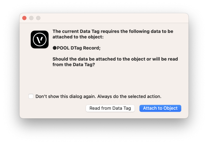
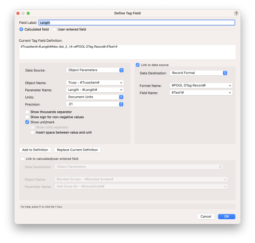
Hi there, I am using more and more data tags to display information from plug-in objects (trusses, hoists, lights...). Therefore ALL or SELECTED eligible mode is the one I use - because I want to tag hundreds of items with one click. F.e. a custom hoist tag or a tag for truss length etc. But this is the same for any tag or any plug-in object. I color this tags with data visualization depending on their tagged information or I use them in marionette. To be able to do this you have to set a "link to data source" (a record) inside the tag field and attach this record to the tag itself. Then the information from the tag field is not only displayed in the tag - it is also written into the record field. And this record field is used within data viz, marionette and so on... The record must not be used for the objects you are tagging. No comes the problem: With a record attached to the tag but not to the object ALL or SELECTED eligible mode is not possible Why is this the case? For making it short I quote @Nikolay Zhelyazkov who was really helpful about this topic: I can understand why the modes aren't allowed, but for my work there is actually no other way around and I think I am not the only one. So what could be a solution? I don't know if this is possible, but maybe this could be one: Only in the ALL or SELECTED mode: If it is detected, that a record is required at the objects for the tag to work 1. display the dialog as you get in SINGLE or LABEL mode 2. but don't give the option to "don't show this dialog again. Always do the selected action." for the dialog. 3. display the dialog with every use of the tool only once - not for every conflict it goes through 4. For every conflict do the same choice like you decided in the dialog PROS: + nothing will change for the currently working modes + ALL/SELECTED will work for this scenario CONS: - no possibility to hide the dialog completely - different choices within a tagging is not possible -> select the ones you want to have the same choice and run SELECTED mode. If you also want to have this to work please vote this up! --------------------------------------------------------------- Setting up the data link: The error message you are given in ALL/SELECTED mode: The dialog you get in SINGLE eligible mode: Original thread with more background information : How to set up a data tag for use in data visualization: Thank you @Tom W. @Nikolay Zhelyazkov for helping me out
-
- 1
-

-
- data tag
- data visualisation
-
(and 1 more)
Tagged with:
-
As above, this would be a really useful functionality that would allow symbols or styles to be clearly identified on a drawing with an associated Graphic Legend reporting that data about that object/style. For us, we could then basically automate the way in which we identify differing wall styles on drawings. Currently this is just a regular viewport with all the colours added to the annotation space. The wall descriptions are then manually typed out. This introduces a lot of potential for errors, not to mention it being a tedious task. Other people have different uses for it as described here. This could be an extension of the "Filter by Viewport" option of graphic legends or something else, but certainly it seems like the functionality to achieve this is present in VW albeit in separate parts.
- 1 reply
-
- 16
-

-
- graphic legend
- data visulization
-
(and 1 more)
Tagged with:
-
Hey, I want to start out by stating something about the entertainment industry where i work. Some projects are huge and the work on a drawings goes on for months. But very often complete drawings and final prints made in just one day or two. Meaning that time is of the essence. So to the post: I often find the need to make some items in my drawings stand out. Both during drawing but also for the sheet layers and final prints. Like this is a special part or to separate many different parts in a crowded area. Like scaffolding, stages, fixtures, where many items are very similar and you want to make it easier for the reader of your drawings to see what is what. And to do the mounting correct the first time. Data visualization is a very good tool to make this work. I have used it a lot, and it works very good in many ways. It gives a good overview of color settings, it is easy to change visualization settings and it updates instant if a new symbol is added to the drawing. This is very good. But when you just want those symbols to be blue, the data visualization tool is very tedious. The filter system is quite horrible and quite counter intuitive. I admit this might be for a newbie as myself and this will ease up with time. But still, the process of just making those symbols blue are quite overwhelming when that is all you want. I can only guess and imagine why the data visualization tool is made, but i would imagine one of the reasons for this is to make it possible to actually color those symbols without having to navigate trough to all the classed the items in the symbol is placed and change the color settings. But one thing i cannot understand, is since the data visualization tool is able to "override" all color settings trough the objects found in via the filter, why I cannot do the same thing via the attributes palette. Why is there not just a checkbox in the attributes pallet that says "Override"? If you then select a symbol and chooses blue fill and nothing happens, one can select "override" to make the selection act like the data visualization tool. If one selects to use the class settings, one can make the same override selection in the class settings. This is just as much a discussion and a wish. I cannot imagine that I'm the only one finding this data visualization cumbersome, and wishes for something easier. While I'm on the data visualization tool, it would be great to also have more options on how to "automate" the color settings. As the list is sorted and not possible to sort differently, similar items often is over/under each other. Very often one needs to separate those parts particularly. So a option for random, and not rainbow color settings would be great. To the very last, it would be great to be able to filter out data visualization for items not in the drawing. Constancy is something many value, and therefore i made a complete data visualization for all of our scaffolding matching the actual color code they real items are marked with. But, the legend in a view port lists absolutely all lines of the data visualization and not only for the symbols/items in the drawing. Giving a lot of unwanted information to the reader of the final print.
-
DATA VIS - can not control all components with material resource
drelARCH posted a question in Troubleshooting
Hi while it is possible for some objects with components (slab, wall, roof) to control their materials section fills attribute through data visualizations we can not do it with components in slabs with aligned surface (hardscape type) and new site model components which is strange...see attached screenshot with aligned slab not taking light gray solid fill from data visualizations. I dont write this post in wishlist section as this appear to me as an item that needs to be corrected ... as it is possible to control these components with materials applied using class function or other value but not by material value so only way to achieve same graphic appearance now in section viewports is to have multiple visualizations selected. Please make this process consistent throughout all components with materials. --- Another issue with mentioned objects (aligned hardscape + site model) is that it will not display 'profile line' set in 'advanced properties' in section viewports Can we have a fix for these issues?-
- 2
-

-
- data visualisation
- component
-
(and 3 more)
Tagged with:
-
Hi Everyone, I am having an issue where my sheet layer shows a plot which is coloured based on the Universe of the fixtures, which works really well. However when i publish that sheet layer it looses the colours for the fixture and shows them all as grey. The data visualisation key that it produces in the annotation, does however output with the correct colours. Any thoughts on a simple setting i might be missing? Worth mentioning its 2020.
- 5 replies
-
- data visualisation
- spotlight
-
(and 1 more)
Tagged with:
-
Submitted on behalf of a Vectorworks user/client. They pointed out that when Data Visualization is being used to represent values of given objects, how cumbersome it is to manually update record field values if an object changes - for example - in dimension or area etc. His suggestion is to add the capability for Record Field Values to be drawn from object values in the Shape tab of the Object Info Palette. I seem to recall witnessing an implementation of this type of thing using Marionette, but this doesn't translate or connect to the Viewport Data Visualization facility.
- 1 reply
-
- oip
- object info palette
- (and 4 more)
-
Hi, We have been attempting to use the new data visualization tool, which clearly has the power to become very useful. However we are having some difficulties. Firstly, even using this tool in a basic way seems to cause extreme slowdown. Secondly (and more critically for us currently), the display for some areas seems to be buggy and 'stuck' on an incorrect hatch colour. Please take a look at the video below which shows the issues. The beginning of the video shows how quickly our systems handle navigation on a normal sheet without data visualization turned on. The second sheet shown is using simple data visualization to show space objects with various coloured hatches applied. You can see how much more slowly this sheet refreshes as zoomed or panned, which is infuriating to work with. But the area which is coming up as as a black hatch at most zoom levels is the most problematic. This type of issue has cropped up on a couple of our drawings, and is still present on pdf's if printed at this scale.
- 7 replies
-
- vwx 2017
- data visualization
-
(and 3 more)
Tagged with:


