Search the Community
Showing results for tags 'home screen'.
Found 2 results
-

Home Screen (Mac): Un-grey File/Open Recent
roscolux posted a question in Wishlist - Feature and Content Requests
When only the Home screen is open - the File/Open Recent menu items are greyed out. I find myself stalled here often. Please bring back the Open Recent menu, thanks! -

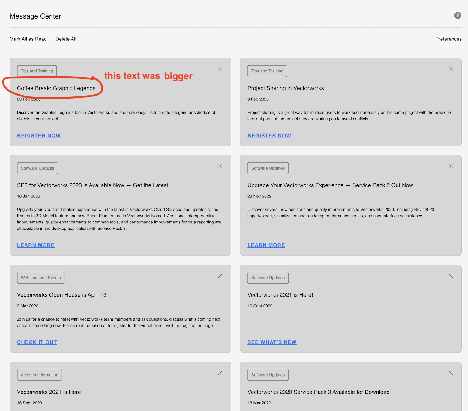
Home Screen: unread not clear enough
Christiaan posted a question in Wishlist - Feature and Content Requests
I was looking at the Message Centre in Home Screen today because it was saying I had an unread message, but I couldn't easily tell which message was unread. I don't have an example now of what it looked like but I'm pretty sure the only difference is that the title text was a bit bigger. It would be useful if it was much clearer. Perhaps by changing the colour/shade/boundary of the box it's in?