alex_angusandmack
-
Posts
4 -
Joined
-
Last visited
Content Type
Profiles
Forums
Events
Articles
Marionette
Store
Everything posted by alex_angusandmack
-
Legibility Issues in v2024
alex_angusandmack replied to alex_angusandmack's question in Troubleshooting
Ah fair enough. Means one more click to get to a frequently used feature but it's probably high-time I set up a keyboard shortcut for it anyways. Would be amazing if we could actually re-organise the bar ourselves, dragging and dropping buttons etc. -
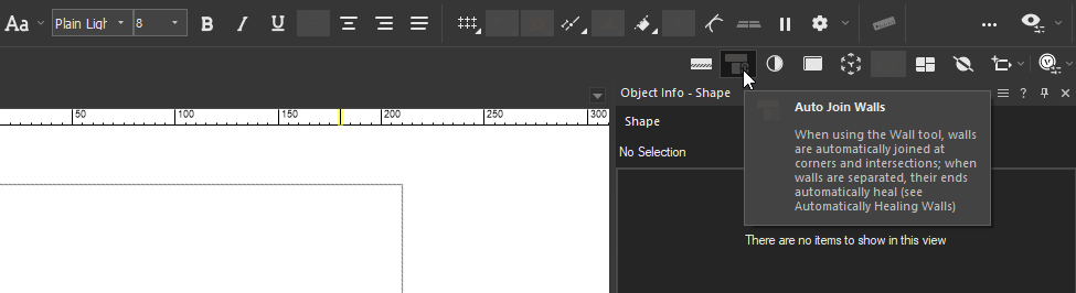
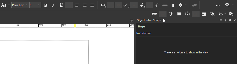
I appreciate the effort put in the updated graphics but am wondering if it would be possible to improve the legibility of setting toggle-buttons. Options that are toggled on in the view-bar are virtually unreadable on Windows. See "Auto Join Walls" button below: I, for one, can't distinguish the icon unless I highlight it by hovering the cursor over. On a side-note the "Look At Working Plane" button has been removed from the top bar though, oddly, the "Align Working Plane [...]" one has been retained. Please tell me I'm not the only one annoyed by this?
-
Hi Pat, Thank you for the tip and apologies for the late reply. I see how that would work in some scenarios but perhaps not the one I'm in: The record is being updated manually not via a script. If you manually change a record field from the OIP this does not seem to force a reset of the parent plug-in-object. This is the functionality I was aiming for: Essentially using record fields as data-entry boxes for a plug-in-object rather than having to add more editable parameters to the object definition. Might be the functionality is just not supported by the API?
-
Hi folks, Does anyone know of a way to force update a PIO when a field is changed in an attached record?