All Activity
- Past hour
-
 Working in Spotlight, I have a Renderworks Camera feeding a Viewport on a Sheet Layer. The Sheet Layer is set to A4 size at 96dpi while the Camera is set to a 1.5 Aspect Ratio for Film Size of 8"x10" at 96dpi. The Viewport is scaled at 1/4"=1' which fits it nicely onto the page and there is no crop on the viewport. My question is...how do the two DPI settings interact? If I want to raise the DPI of the output to 300dpi, do I only have to adjust the Sheet Layer DPI in this instance or do both Sheet Layer and Camera need to be set to 300dpi? Thanks, Phil
 -
Mac OS Sonoma 14.4.1 makes VW2024 unusable
zoomer replied to astephens's question in Troubleshooting
I had that once for VW and Bricscad too. But that was with 14.4.0. and not seen it in 14.4.1 again so far. I use a M1 Mini desktop with a single Monitor. On a Macbook with multi monitor setup or clamshell mode it may be more likely to experience such problems. For Macbooks, for similar issues, it was recommended to just close and reopen the lid. When I lost my VW Menu, I realized that there is still the Apple and VW main entry on the left. And when I clicked on the VW Menu, my whole VW Menu came back .... -
 bguthrie joined the community
 -
The Gizmo only appears in 1st and 4th Mode. When you switch to 2nd or 3rd Mode, there is no Gizmo. In the Video you switched through all Modes already, but you Selected in Mode 1 and 4 only, the ones with Gizmo visible .... Why it does appear in 1st Mode at all - no own knows ...
-
 I am using Ventura 13.5 and an M2 Macbook Pro with 16 GB of RAM. If I need to add this as a bug, I am happy to, but I don't know how to do that.
 -

Mac OS Sonoma 14.4.1 makes VW2024 unusable
Leon You replied to astephens's question in Troubleshooting
I updated to MacOS 14.4.1 and then lost the main menu of my Vectorworks update 4.1 (Build 750359). This also makes my Vectorworks unusable. My computer is a Mac Book Pro 2019 Intel chip laptop. Anyone has the same issue?
-
They made a couple of changes to icons in VW2024. One of them was moving away from the .png file format and instead going to .svg format. This is great because .svg format is actually a vector graphic, so the icon will scale appropriately between standard density and high density displays. They also added dark mode to WIndows systems, which is what is causing your red X issue. If you want to continue using the .png method, you will need four separate files per icon: Icon.png (26x20 pixels at 72 dpi) Icon @2x.png (52x40 pixels at 72 dpi) Icon_dark.png (26x20 pixels at 72 dpi with colors set for dark mode) Icon_dark @2x.png (52x40 pixels at 72 dpi with colors set for dark mode) VW will determine the pixel density of the display and will choose which icon to display. Even though it shouldn't really matter since you're specifying the exact pixel sizes, Mac requires that you must have a dpi of 72 for your icons otherwise they will error out. I've never had a problem on Windows, but if you will have some Mac users, it's best to plan for it. The key here is having icons with the _dark suffix, that is what VW will use when you have dark mode engaged. I'm betting that if you were to switch to light mode, your icon would work properly. Now, if you want to embrace the future and use the .svg format, you only need two icons: Icon.svg Icon_dark.svg Since the icons are scalable vector graphics (that's where the svg comes from), VW will automatically scale the icon to match the display dpi. But something to consider is that those icons will not work on versions of Vectorworks before 2024, so if backwards compatibility is important to you, you might want to stick with the .png method. That said, if you're developing plug-ins in VW2024, they wouldn't be compatible with earlier versions anyway so it would probably be best to embrace the newer and better format. In terms of how to create the icons, here's a couple of rough work flows you could try. .png method: I use the .png method since backwards compatibility is important to me and some users of my plug-ins. I'll generally draft up the icon in Vectorworks (since it's the drawing tool I'm most comfortable with anyway), then make sure everything has a pretty thick line weight. I'll then zoom out until the icon is roughly the size it will be in the workspace. I take a snip of the screen using the Windows snipping tool, and paste it into Photoshop. In Photoshop, I'll delete the background behind the icon using the magic wand tool, and then use the crop tool with the settings set to 52x40 pixels at 72 dpi. If the output is to my liking, I'll save this as the @x2.png file and then scale that again for the standard 26x20 icon. The real trick is managing any kind of aliasing that happens when the image is "de-rezed", hence why I tend to use really thick line weights. .svg method: Once again, I'll draft out my icon in Vectorworks. From there, I will export it as an .eps file using the File-Export-Export EPSF option. This will give me a vector graphic that I can manipulate in Adobe Illustrator. I'll import the .eps file in Illustrator, and make sure that I set my artboard to be 26x20 pixels. I'll manipulate the icon so it fits within the artboard, then export it as .svg. I'll then make adjustments to color for the dark mode options (such as inverting black to white) and export the _dark.svg file. I recognize that both of my methods require the use of Adobe software. You could try using something like Inkscape instead of Illustrator, which is free, but also does not accept .eps files for import. In this case, you could try exporting from VW as a .dxf file, which Inkscape will accept.
- Today
-
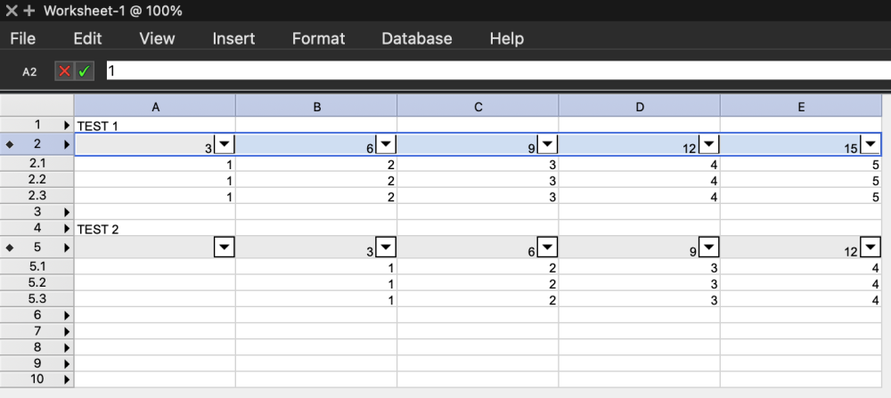
 I'm clicking on the "2", which auto-selects the entire row. (Not by selecting all the cells.) There are no merged cells in the worksheet. This is done with a new worksheet and converting row 2 and row 5 to a database row.
 -
 Braden Graves joined the community
 -
 That's a new one! Are you clicking on the row header to select the row or selecting all the cells? Are there any merged cells in the worksheet?
 -
When copying one database header row to another row, the data in the columns are shifted to the right by one row. See the image: - Row 2 is copied/pasted to row 5 using cmd+c and cmd+v - Data from column A is shifted to B, B -> C, etc... However, if the row is copied by option dragging, then the columns stay in place.
-
Seems my organization's server is blocking this. What is the website so that I can fix this with my IT people?
-
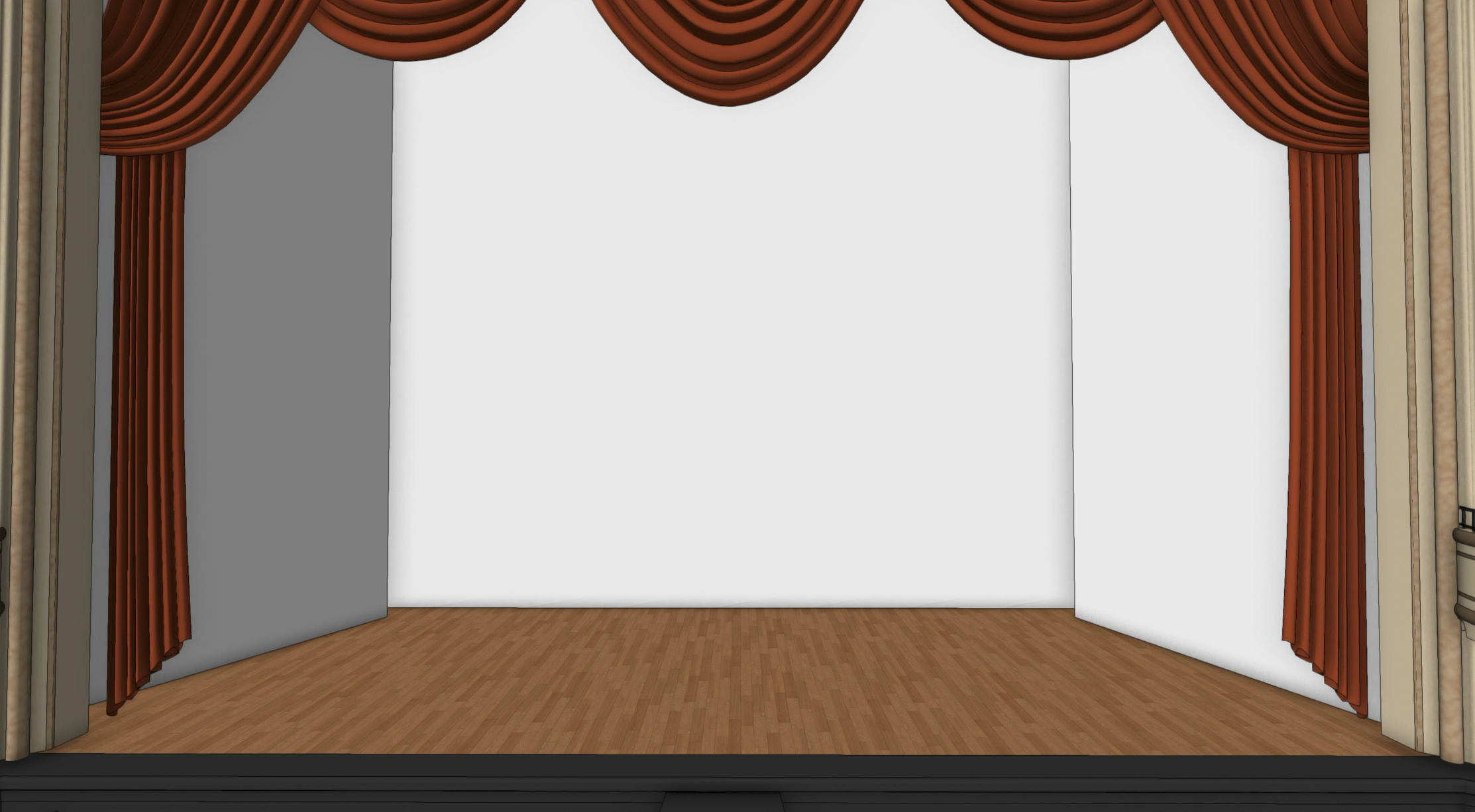
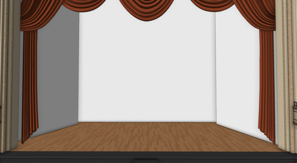
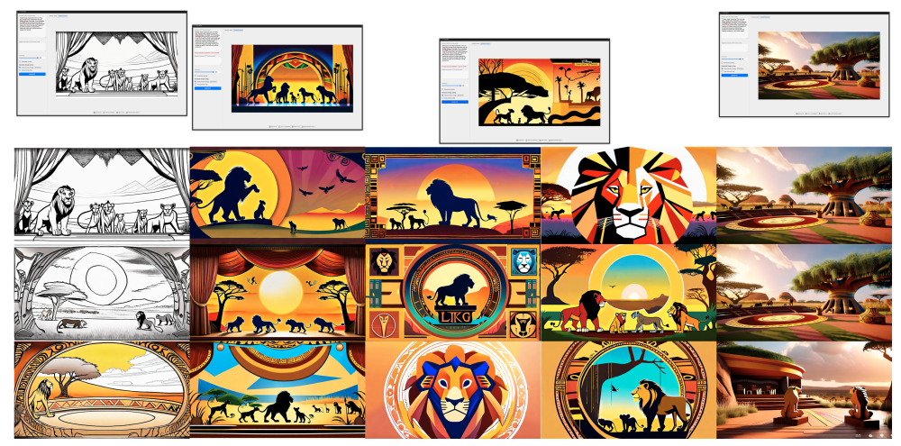
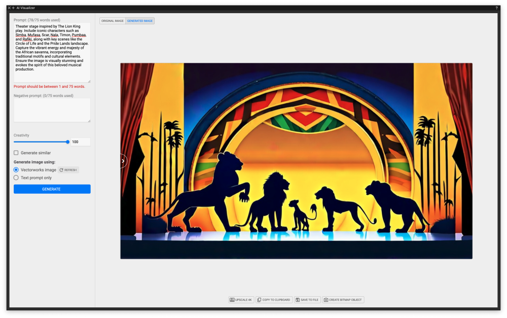
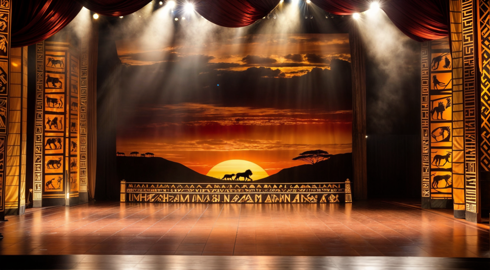
The other day, a friend hit me up for some set design ideas (not my field of expertise) – nothing too fancy, just throwing around some concepts. I figured it was the perfect opportunity to give this new AI a whirl. With ChatGPT's help, we quickly brainstormed some decent prompts to get the creative juices flowing. Here's how it went down: started with basic graphics, think lions and sunsets, then imagined them on a small theater stage. Sure, there's tons more that could jazz up the set, but these initial ideas got the ball rolling. How about you? Any cool experiences mixing AI into your creative process?
-
Oh interesting!! I'm glad you found a work around. If you could post a VWX that demonstrates the issue with schematic views, that would be much appreciated!
-
So I managed to make the required file size and accompanying high res image but when I upload them to VW for the icon it shows up as a red x. It no longer shows the error of wrong file size but accepts the image and fails to show it.

-
 I see it in both Re-position + Translate + Rotate modes. Can't recall if bug has already been filed
 -
 Actually if you change modes while the dragger is set to Re-position mode it happens for me too. Move it off reposition mode and it resets (graphic attached. reposition mode is the one with the arrow, move it to the other one). Definitely a bug. Kevin
-
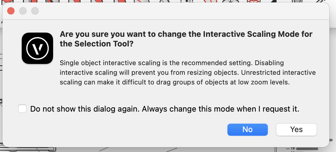
What OS and Vectorworks version are you using? It looks like a bug. I'm on a Mac (current versions of both) and don't see the same behaviour. The only difference I can see is you've dismissed the interactive scaling warning dialog (see attached). Kevin

-
In Vectorworks 2023, is there a way to adjust a texture map in one direction only? For example, if a map shows an oval instead of a circle it would be simple to stretch the map in one direction. Other 3D apps I work with have this fundamental feature, but it seems to be missing from Vectorworks. It is crazy that I can't do it. Am I missing something simple? Thanks, MHBrown
-
Thanks for the answer. In this case I would have to convert a large amount of objects into lines and then check each line with each line of every other object. I'm not an expert at programming but that sounds like it would take even longer than creating the intersection object and deleting it again. It would be great if Vectorworks could add a command that just checks for the intersection.
-
 Seb Romain joined the community
 -
I think I saw posts about this but can't find them now. I think it just affects Disabled Interactive Scaling Mode (i.e. the 3D Dragger is only present when it's not meant to be in this mode). It is a bug but I only use Unrestricted Interactive Scaling Mode so have never experienced it myself.
-
Great Tom! Thanks a lot!
-
Hi @Letti R, Of course your folders are nested. Why would life be easy? The way to get the first folder is to look at everything in the Symbol Library and skip the symbols. Here are two Pascal routines that will return a handle to the First SymFolder. Hopefully you can convert them to Python easily. If not, write back and I can help. function FSymFolder :Handle; { Get a handle to the First Symbol Folder in the Symbol Library. } { 19 Apr 2024 - Raymond Mullin } Const SymFolderType = 92; Var SymHnd :Handle; Begin SymHnd := FSymDef; { Symbol or Folder } if (SymHnd <> nil) then while (GetTypeN(SymHnd) <> SymFolderType) do SymHnd := NextObj(SymHnd); FSymFolder := SymHnd; End; { FSymFolder } The same routine using ForEachObjectInList(). function FSymFolder :Handle; { Return a handle to the First Symbol Folder in the Symbol Library if one exists, otherwise return NIL. } { 19 Apr 2024 - Raymond Mullin } Const SymFolderType = 92; Var FldrHnd :Handle; function isFolder(H :Handle) :Boolean; Begin if (GetTypeN(H) = SymFolderType) then FldrHnd := H; isFolder := FldrHnd <> nil; { return True to stop } End; { isFolder } Begin { FSymFolder } FldrHnd := nil; { Folder handle } ForEachObjectInList(isFolder, 0, 0, FSymDef); { All objects, Shallow } FSymFolder := FldrHnd; End; { FSymFolder } Finding the Next Symbol Folder is similar to finding the first, but you start looking using a handle to the next object after the first Symbol Folder. Raymond
-
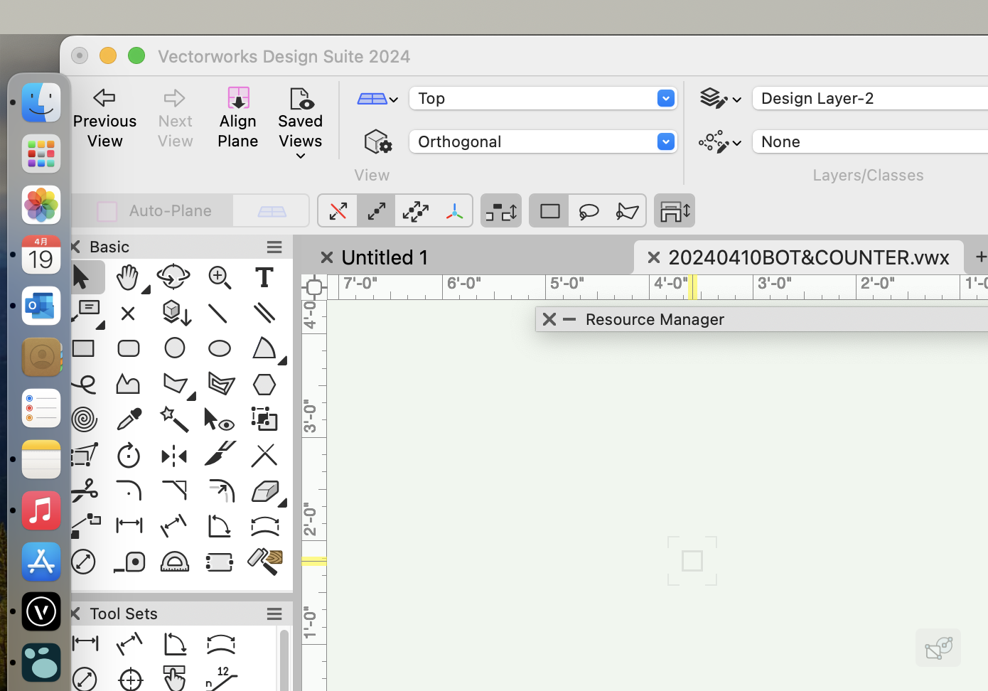
Can y'all explain this behavior then? Why does part of the mode bar change? And then never go back? And why does the gray handle never disappear after I go to the transform mode once, but isn't present initially? New error.mov
-
In the Graphical Calculation section of the VS Function Reference there are a number of intersect functions (Line-Line, Line-Circle, Line-Elipse, ellipse-elipse). Convert a copy of your objects to lines and then check if any of the lines intersect.
-
I found the problem. Schematic views are ceating this bug. To fix the bug you need to have the schematic view in a closed design layer. Do you think this can be fixed ? I have schematic view in all my drawings for vertical position. Thanks
-
I’ve been using this program since 2016. I think there have been 3 significant graphic overhauls in that time. This latest one is the most disruptive with the least upside. It’s the equivalent of turning half the light switches in your home upside down and then reassigning half of those to unrelated functions. You can still turn the lights on, but every time you do it you have to think about how to use the ubiquitous switch for its unique situation. Sometimes up turns on the light, sometimes down. In one room, the switch turns on the air conditioning, in another it opens the garage door. The last time I protested is when they updated the icons to have an overly 3D look. Now the pendulum has swung in the opposite direction to the point of making them even harder to distinguish. That’s a lot of changes to icons in very few years. That makes it hard for people to learn the program and antiquated training materials. I don’t mean to be overly critical, but this doesn’t appear to be the work of an experienced UI designer. The human interaction side of things has seemingly been ignored. Hard to see, hard to find, increased movement needed to access common tools are not improvements. A few releases ago, the redesign of the Color Selector to eliminate the color wheel is simply criminal. To be fair, the creation of the Smart Options a while back is a great example of good UI design. we get it, software changes over time, but a lot of these changes in recent years feel like introducing a new color to an old jalopy that really needs a new motor.