Search the Community
Showing results for tags 'inclusive design'.
-
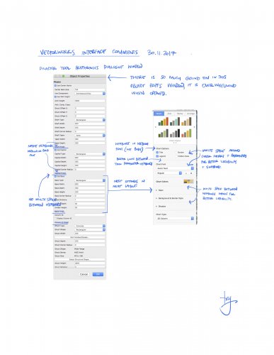
Hi all, Interface seems to be one of my favourite forum topics. This is a conversation I am having with my local distributor. I would consider myself a master user of the app, and I am by no means asking for a dumbing down of the software. What I am asking VWI for is to start reviewing the usability and legibility of the tool. I love the new features that are added from year to year, but I feel that features are being added without proper consideration to layout and interface design. Some examples of what I believe poor interface/usability are - : The new titleblock tool (too many front facing options), The slab tool (editing is no where near a s simple as the Floor command object), Rr the structural member tool (confusing in layout and how it relates to Framing Member and Columns Tools). I may go into these at a later date, but for now a perfect example is the Pilaster object's preferences dialogue window (See my attached markup below comparing the pilaster object with an app that I believe uses better design technique in this area). I would suggest with some input from a inclusive design consultant, and applying simple graphic / UI design techniques Vectorworks could bring more order (and approachability/usability) to an app that year by year becomes more laden with long lists of parameters in dialogue and palettes. Yes, with the complexity of modern architecture, we need more settings. But the settings should be as simple as possible to comprehend quickly. Deeper settings can be nested and revealed as required. And with the use of styles, the more complex settings are often not required to be seen most of the time. What do you think? Cheers.
- 13 replies


