Stephan Moenninghoff
-
Posts
1,330 -
Joined
-
Last visited
Content Type
Profiles
Forums
Events
Articles
Marionette
Store
Everything posted by Stephan Moenninghoff
-
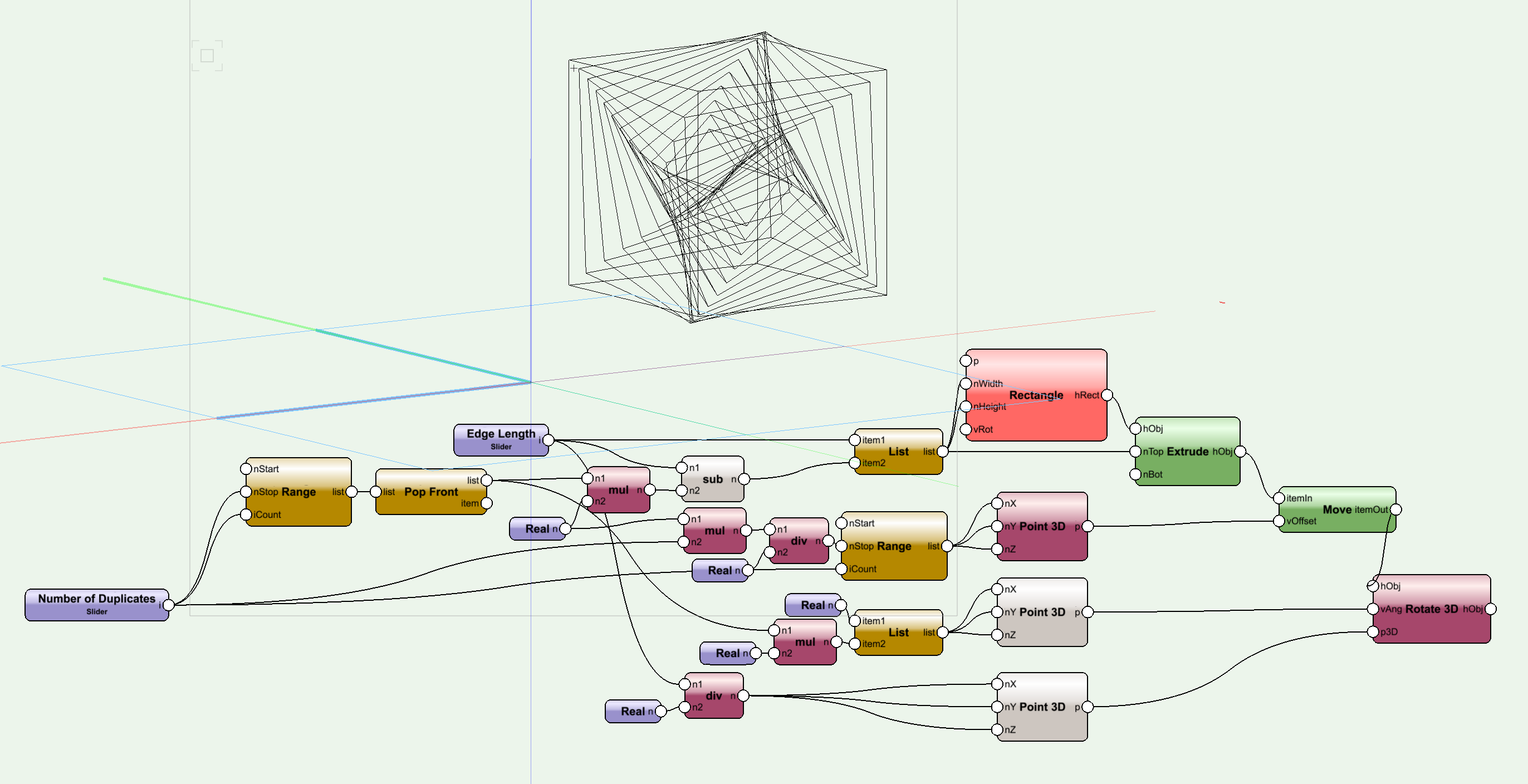
Try this. It's not far off, just needs some refinement. Vortex Box.vwx

-
@Palle You need to supply a list of values to the rect and, subsequently, extrude node. That will take care of everything. The ordered list is not necessary for this kind of thing.
-
The Books have been converted to run with VWX 2019 and I fixed an error where the 'Hardcover' library needed a shelf depth and height of 2m to produce any books.
-
 Yes but what I am proposing are changes pertaining to the functioning of the UI. That's UX. What I was trying to say was, let's not confuse VWX functions ("How do I change the crop of a viewport") with UI functions ("How do I access the side pane widget while the RM is in a docked state").
 -
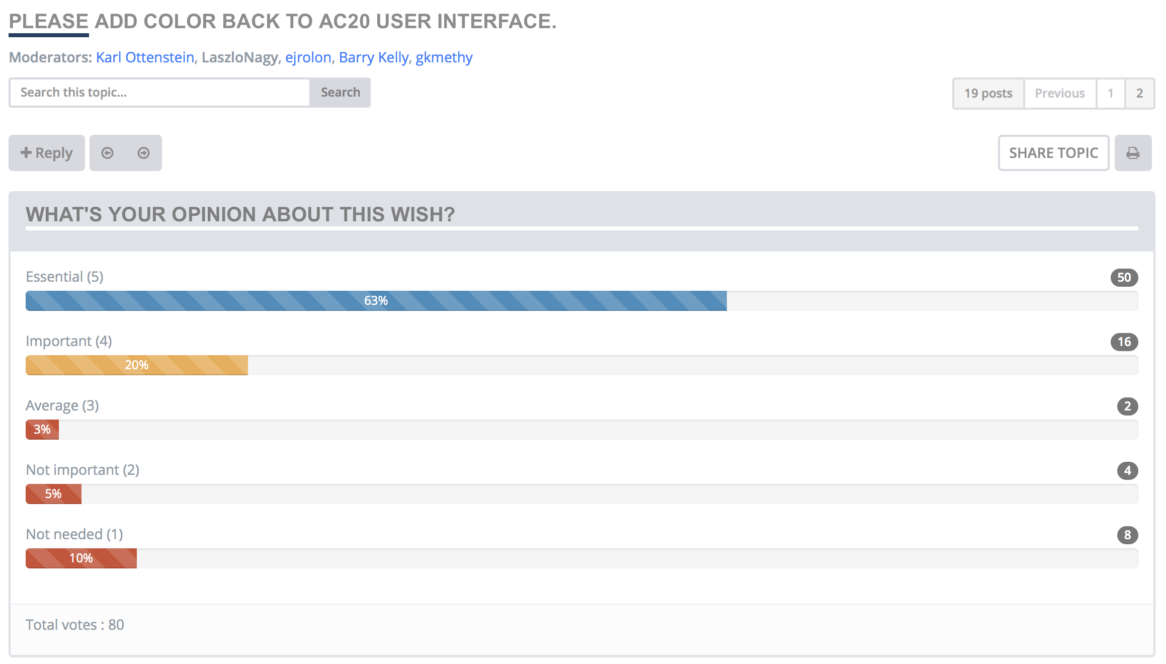
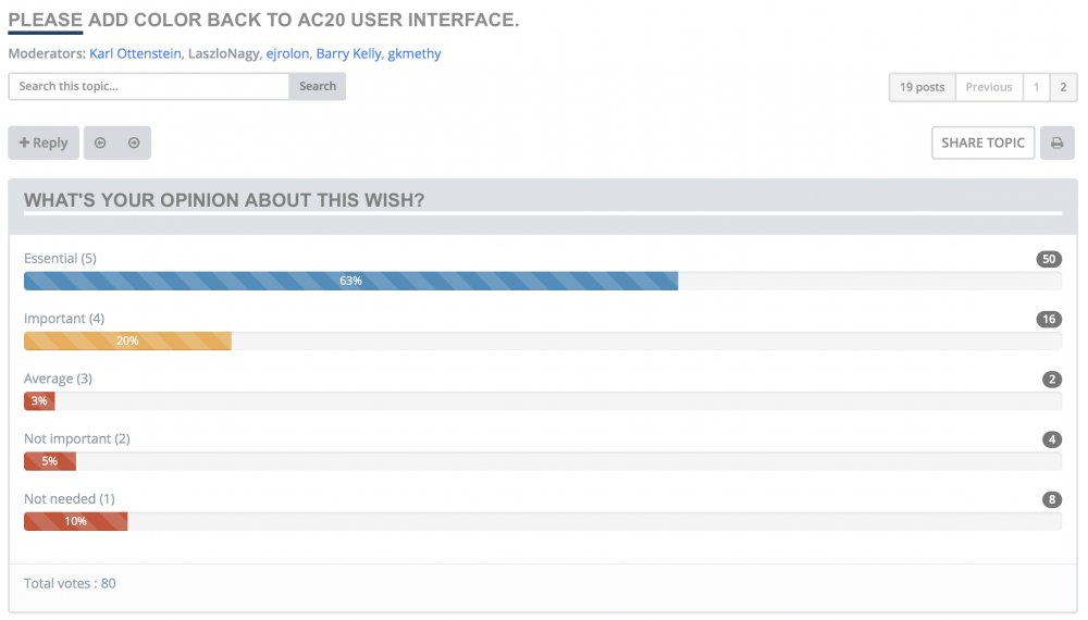
Interesting poll about colour in the Archicad UI after it was made all white. Yeah, one needs to be careful, users are fickle... 🙂
-
Jim, with the Resource Manager, users were not given a choice though. They *had* to use it. And while it's better than before, the UI does still not allow for the RM to be used in a docked state. I do tech support once a week (because I want to) and whenever I Teamviewer into customers' screens, I see the RM floating and collapsed. Why? Because its options are not visible in a docked and hence narrow state. This is a pure UX thing and I think it needs to be addressed. I have detailed how it could be addressed in my prototype. I am not proposing that my graphics be used (I think they are just next year's old UI and some young, talented designers will do a better job, no doubt) but the way it *behaves* isn't right. It's a usability bug if nothing else.
-
All good and well but please let's not create the standard excuse for not caring about the aesthetics of the UI here. This thread is and has been about how VWX *looks*. Perhaps also a little bit about how it *feels*. But not about how it *functions*. A modern appearance is completely separate from functionality and what this thread is about is mostly aesthetics. Improving on features has never been a weak part of VWX, in fact I think we must admit that huge progress has been made over the past years. This all has happened while maintaining a dated and clunky UI. That is what this thread is about so please let's not muddy the message by such comments (although I'm sure it is a valid comment in a different thread).
-
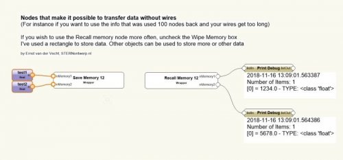 Sending and receiving values from any node is a good idea and other node-based apps have it, too (screen shot from Origami). Any output should be able to be fed into a sender node and received anywhere for input. That would be a welcome new feature for Marionette.
 -
Oh, yes, sorry, forgot to mention that. Those are the first things we check. Thanks!
-
Confirmed. The Resource Manager previews also show the black backgrounds. Once edited on a different machine, they return to normal.
-
Today everything is back to what it was before. So, again, the user folder must be reset to fix the black renders. I wonder what brings this about. Is there anything the customer might be doing, that provokes this behaviour?
-
Thank you @David Sand @Bas Vellekoop. Bas' suggestion solved the problem so thanks for saving my day! Yes, deleting the user folder is kind of brute force and should be done with care. I have restored the customer's workspace and everything seems fine now.
-
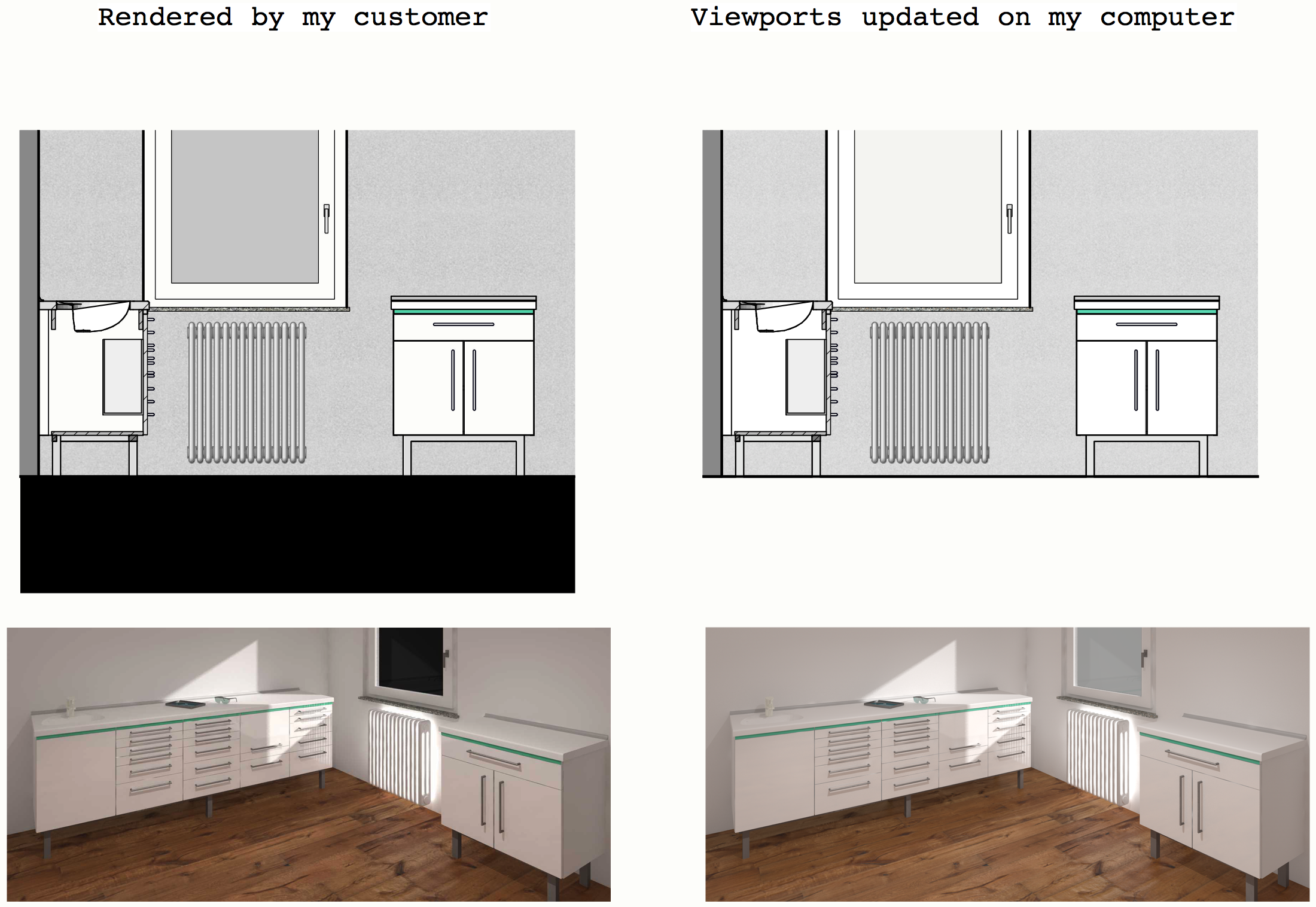
Here are two viewports rendered with OpenGL (top) and Renderworks (bottom) on a client machine (left) and the same viewports rendered on my computer (right). The client is quite desperate because he is getting these black backgrounds in both OpenGL and Renderworks intermittently. He is also seeing white (RGB 255,255,255) areas in rendered images turning black on his computers but nobody is able to reproduce the behaviour anywhere else. Any ideas? Thanks!

-
Dark Theme Please
Stephan Moenninghoff replied to Kizza's question in Wishlist - Feature and Content Requests
Check out this mockup and while you're there: please upvote the topic 🙂 Thanks! -
Tabs would definitely have to be more dynamic. Developers should be able to decide which tabs, besides the stock ones, they want to add. Also, why is the Attribute Palette not part of the OIP? There are some really nice opportunities there. Just think class attributes and the like. I still keep thinking I'm overlooking something though and there are some logical clashes there....
-
I made another little video. There were some comments and suggestions about the OIP earlier in this thread which I thought about. (There's more to come. I have been thinking about why the Attributes Palette is not part of the OIP and I think I must be overlooking something...) and I received some personal messages about how some of the things I proposed did not come across in an understandable way. Goes to show that everyone, including myself, struggles with that elusive chasm between sender and receiver. As always, here my little disclaimer: I haven't the slightest clue if any of what I am proposing makes any sense to anyone else or if it is even possible to implement in Vectorworks. Still, please upvote this if you haven't already (the little green triangle, right at the top...) 🙂 PS - there's a little bonus extra at the end. Wait for it... OIP.mp4
- 190 replies
-
- 18
-

-

-
Preview Render
Stephan Moenninghoff replied to Ian Dallimore's question in Wishlist - Feature and Content Requests
That's how I do it. -
That's what the gradients are for. But you may be right after all. I suspect it would be too much of a paradigm-change 🙂
-
Yes, and I was only proposing a substitute for scroll bars for tool palettes, not the RM. I don't think it's too critical though, just a detail. However - It goes to show how difficult it is to craft a UI for two platforms if you don't want to create your own UI. The treatment of scroll bars is quite different on Mac and Windows and needs some consideration. It can be done though and it can be done quite well. Agreed. That's why I am proposing a popover window instead of a menu. A popover is something that allows multiple choices and each choice is carried out or applied immediately. No confirmation necessary. Klick outside it and it goes away. As shown in the last prototype movie.
-
BTW a scalable UI is nothing too exotic. Blender has had this forever. Not surprisingly - as they use vector-based UI-elements. Pixel-alignment is not too great for non-multiples of whole pixels but it applies only if a low-res monitor is used. On Retina/5K monitors, the blurring is negligible. Blender.mp4
-
I know what you mean @zoomer about those scroll bars. It can be irritating. Nevertheless, tool palettes are unlikely to have a large number of hidden buttons if they are standard out-of-the-box palettes. If they are made by yourself and you know what's hidden, that's also ok. So I would really love to see how this works in the wild. Interesting though what happens when people start to use horizontal tool palettes. Does every user know about the Shift key for horizontal scrolling? So, yes, there is some uncertainty there. But this is what user testing is all about. I firmly believe any radical departure from the status quo needs very thorough user testing.
-
Here is an excerpt from another proposal I made in 2016. This is about how the Quick Prefs and some other UI elements of the main drawing window might be improved. It already looks quite dated now which goes to show how quickly UI, icons, dialogs etc. start to look dated. In other words: it's not enough to do it once. Just like other features are improved and updated every few years, so should the UI. Not easy to do.
- 190 replies
-
- 13
-
-
RW Styles: Quality settings for Blurriness & Soft Shadows
Stephan Moenninghoff replied to Andy Broomell's topic in Rendering
Shame I will miss your talk! -
Accepted! Nice way of doing this, @Peter Neufeld! Thanks for sharing. I wonder what other methods will arise. Did @Jim Wilsonnot have plans to show us his? 🙂
-
Yes, I don't think that's actually a bug that would merit logging. More like a limitation in what surface modelling can and cannot achieve.