

MartinFahrer
-
Posts
165 -
Joined
-
Last visited
Content Type
Profiles
Forums
Events
Articles
Marionette
Store
Posts posted by MartinFahrer
-
-
4 hours ago, jeff prince said:
True.
If we don't have the tools to do our work in an efficient and profitable way, it doesn't matter how pretty the program looks.
True but if clients are looking at the software we use and think it's less than autocad, then the job will go to the person who is perceived to have the more professional program. It is about efficiency true but also about perception. Throwing the bathwater out for 1/3 at the most of the users is a mistake.
-
27 minutes ago, Andy Broomell said:
Hmm, not sure then. I haven't heard of any bugs related to this, but who knows...
I assume you've tried a full restart?
Yes a couple times, I might be missing something will call support tomorrow.
-
48 minutes ago, Andy Broomell said:
When you change to a 3D view, what is then checked under View > Rendering?
Wireframe is even though I have it set to Open GL
48 minutes ago, Andy Broomell said:Does the object have a solid fill in the Attributes Palette?
Yes solid fill see below this is when I manually change to open GL
48 minutes ago, Andy Broomell said:
-
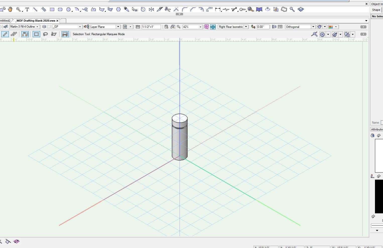
Taking some time learning 3D ,I usually draft in 2D, I wanted the Default when working in #D to be oppen GL. In my preferences it is set to Open GL but when I go from top plan to any 3D view it still in wire frame. Am I missing something. See images and video attached
![2020-06-03 17_18_40-Vectorworks Designer 2020 - [_MDF Drafting Blank 2020.vwx].jpg](https://forum.vectorworks.net/uploads/monthly_2020_06/2093272227_2020-06-0317_18_40-VectorworksDesigner2020-_MDFDraftingBlank2020_vwx.thumb.jpg.7f58e9f3865de9af52b714c2aa0adf81.jpg)
-
16 hours ago, E|FA said:
@JuanP I'm curious if VW has any data on user dissatisfaction with the lack of dark mode in 2019 (Mac only) vs user dissatisfaction with the new GUI. Did VW do any outreach to users regarding the new icons before committing to the changes?
Thanks for the updates and keeping an eye on this thread.
Yes I wonder that too, Why design the interface for 1/3 of the users? Disregarding Mac Light Mode and PC users? I don't understand the need for icon change just so Mac Dark mode would look good. was there an outcry from Mac dark mode users, or was there one person on the GUI team enamored with Dark Mode?
-
 1
1
-
-
I was taking the Core concepts class just to keep my skills up in VW, they were using the 2019 version. Sigh I forgot how professional the program looked back then compared to the cartoon icons we have to deal with right now. Glad I don't have to show anything on zoom.
@JuanP - Are you guys working on this? Can we get it fixed before we are going to go back to work virtually in the fall
-
Just wondering if there are any plans in the works for discounts for subscribers? I accepted that the price went up but for the past few months thanks to Covid 19 I am not using Vectorworks. I was wondering if there were any plans for a discount in the yearly subscription (I just paid my 715$ for the year). Both Gieco and State Farm insurance companies acknowledge that cars are not being driven as much and have both offered a 15% discount. Might be a nice community thing to do.
Just a suggestion as a way for Vectorworks to help give back to their supporters.
-
8 minutes ago, Pat Stanford said:
I would suggest that rather than AS NOTED it place a user definable text string. AS NOTED could be the default, but make it changeable to be as flexible as possible.
1 & 2 sound good.
3 would be the same as 1.
Thanks for asking for input.
Yes to all of that! thanks for working on this!! I have always said VW has the best tech support, you have always been there when I have had to call in a problem. It's nice to see this being addressed to.
Thanks again
Martin
-
1 hour ago, Andy Broomell said:
It might vary by industry, but in entertainment "As Noted" would be common for multiple scales on one sheet (assuming each view has a drawing label that indicates the scale).
Yep that's how I do it.
@Andy Broomell really brings up a good point @Pat Stanford @Nikolay Zhelyazkov . If there are multiple scaled viewports the TBB should be able to recognize that and defalt to the scale being "AS NOTED"
This would be the same reason we want to have the choice of architectural or engineer depending on how the design layer is set up, it just makes things more efficient and faster than typing it out. All you have to do is click on Update scale. -
36 minutes ago, Pat Stanford said:
@MartinFahrer I thought that was what I was saying.
If the user sets the scale as Architectural then it should be Arch in both Drawing Label and TBB. If the user sets scale as Engineering then it should be Eng in both DL and TBB.
The edge case is where there are multiple viewports with different scales and even worse different standard (eng/arch).
Hmmmm so where does a user "set" that then? Or are you saying that is how it "should" work and I am misunderstanding you saying this is how it works.
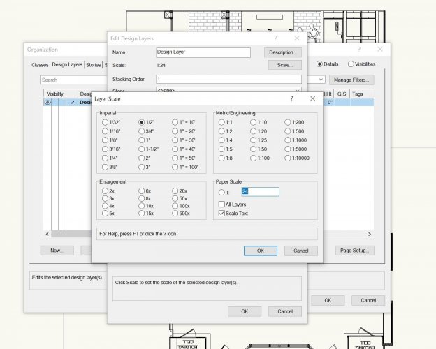
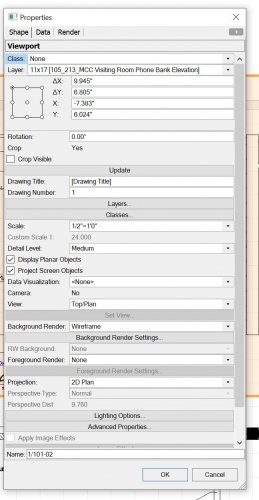
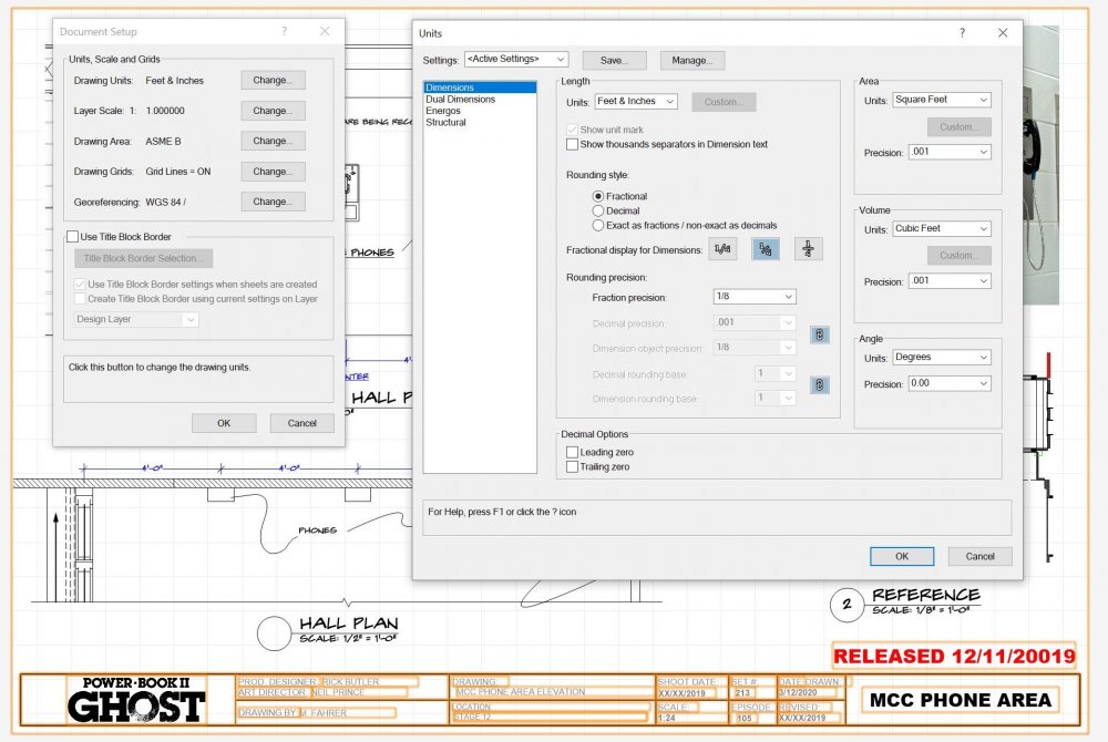
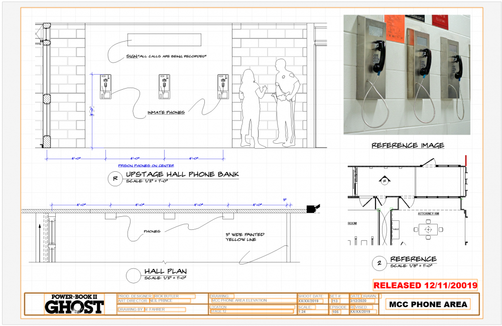
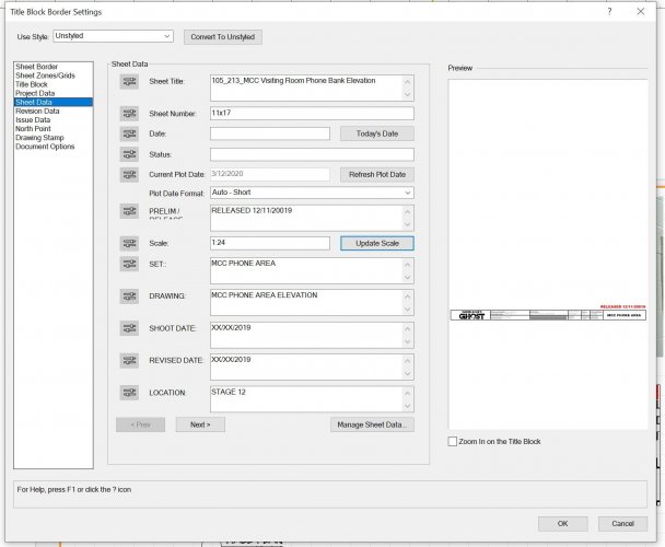
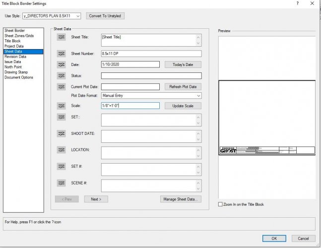
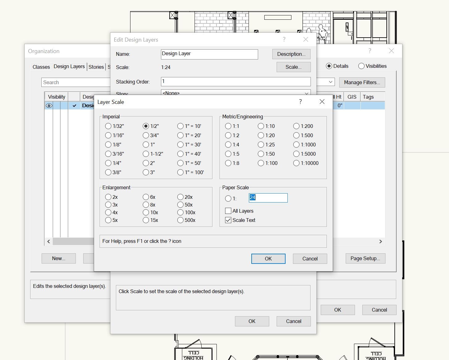
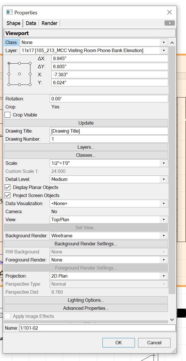
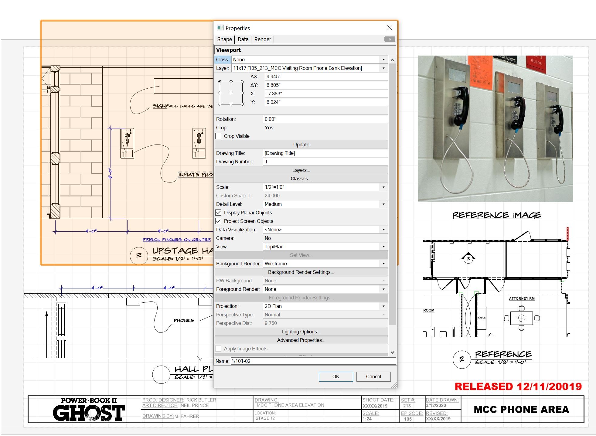
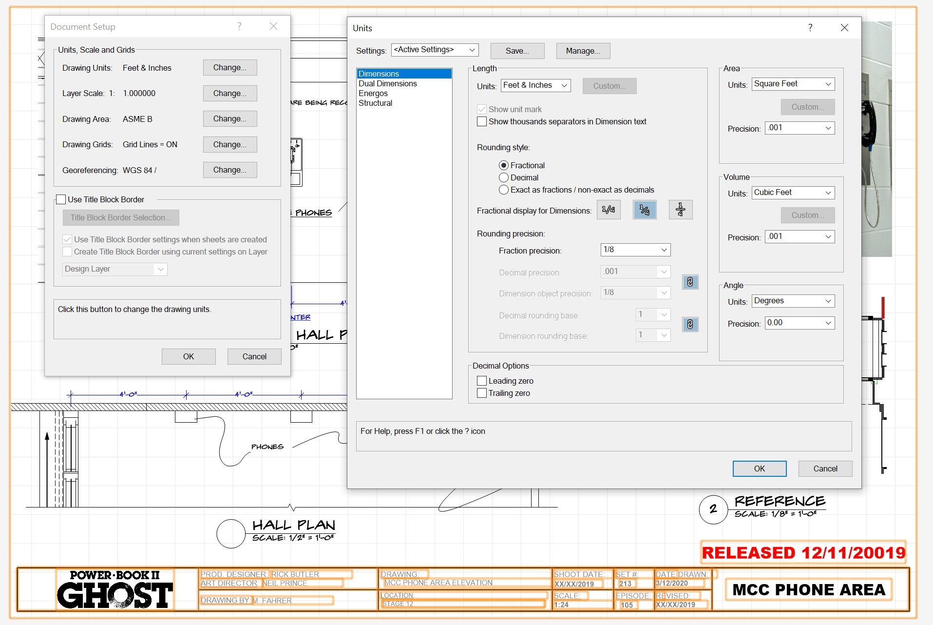
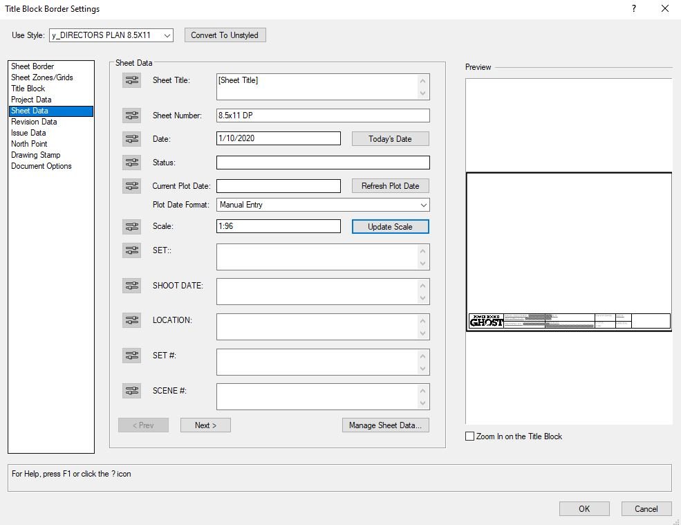
You can clearly see in my example that the Drawing Label is default architectural style, however the TBB is in engineer. If you look at screen capture #1 you see the design layer is set at 1/2" scale. Screen Capture #2 the viewport is set at 1/2" scale which is reflected in the drawing label. Screen capture #3 shows when using the update scale in the TBB it defaults to engineer and I have to manually type in architectural. Note the viewport scale is set to 1/2" (Architectural) and the scale in the TBB is clearly 1:24 (engineer ). Capture #4 shows the document settings in units is set to fractional / feet and inches, not decimal.
I can't think of any place else where I can set scale or units. If you know please direct me.
Thanks

-
No if you press "update scale" in the TBB sheet Data the scale is engineer if I want to have the TBB scale architectural I have to type in manually 1/2"=1'-0". see below examples.
-
6 hours ago, Nikolay Zhelyazkov said:
Hello @MartinFahrer, @Pat Stanford, @Matt Panzer,
Could you give me your opinion on this question: Should the TBB use the architectural scale as set in the viewport scale popup or as in the Drawing Label (where 1:1 is set as Actual Size and 1:2 is set as Half Actual Size, etc.)
Thanks,
Nikolay Zhelyazkov
Prefer the option to use either and have the flexibility to set either as the default. I prefer Architecture, which is "Actual Size" for 1:1 or 1/2"=1'-0" instead of 1:24.
-
13 hours ago, Kees W said:
Silly as it may sound, it still annoys me a little on a daily basis, and I just don't need that kind of distraction from a tool that I otherwise hold in high regard.
And, yes, I am on a Mac, and no, I will not be using dark mode
Still annoys me too, but I have customized my tools so there aren't so many. If I had real confidence I would just turn them all of and use short cuts. Alas sometimes I forget the short cut.
-
Don't reall use those, I tend to make everything custom. But I need my drawings to look realistic and have all the molding details that no cad program really deals with.
-
5 hours ago, Nikolay Zhelyazkov said:
Hello @MartinFahrer,
The TBB is displaying the paper scale of the layer (respectively the custom scale fo the Viewport) which is always in this format.
Anyway, as this seems to be important feature for you and other users, we will investigate if it could be done the way you want it.
Best Regards,
Nikolay Zhelyazkov
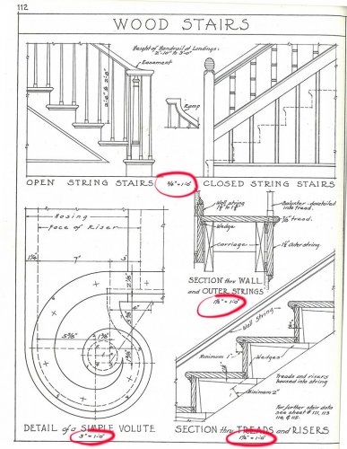
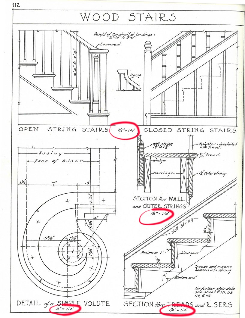
That would be great! Architect scale is traditionally represented in the form of a fraction ie - 1/4"=1'-0". Standard for all my drawings going to construction since hand drafting. It's an architectural graphic standard, as referenced in the attached image below from Ramsey/Sleeper's first edition Architectural Graphic standards circa 1932.
-
It seams that when I use this button I get a 1:48 engineering type scale instead of the standard fraction in an architect scale 1/4"=1'-0".
I don't know why it doesn't match what is shown as my scale in the viewport. See attached images
1- What I see
2-What I want
3-Viewport

-
So I’m teaching a masters workshop in TV and Film design NCSA and asked the masters degree students what they thought of VW 2020 without mentioning the UI or this thread. Not one of them liked it. I was even asked “what was up with the cartoon icons.” I asked if any one of them used “Mac Dark” and not one of them did.
Makes me wonder who on the UI team is enamored with Mac dark, and did VW shoot themselves in the foot ignoring 3/4 of the users (pc dark, pc light, and Mac light) just to cater to the shines new product in the room “Mac dark”.
makes no sense.
listen to the future pro users to please.
-
1
-
-
2 minutes ago, tshelton said:
@MartinFahrer The funny thing about that screenshot you posted, is that those icons are all the new icons, but they look a lot better because the unselected ones have been grayed out and only the selected one is colored. I think this could be a really easy fix and would look great reversed on a dark background as well.
Wow you are right I just noticed that.
-
I had to watch the promo videos wow I have to agree so much better than what we have to look at. So crisp and clean less cartoony and bulbus. I hope some one is taking notes.
-
7 minutes ago, RussU said:
This made migrating to VW incredibly quick for me, and now I can seemlessly jump between Adobe products and VW hundreds of times a day and be sure footed from one program to the next.
I wish I would have thought of that. I learned hotkeys on VW so I customize my other programs to match.
-
10 minutes ago, SeanOSkea said:
But don't fix what ain't broke. Last year I would have said, "I got 99 problems with Vectorworks but the icons ain't one." Now I have 100 problems.
100% agreed.
-
2
-
-
1 hour ago, RussU said:
I think it's the same as me using photoshop on my machine and my kid using ms paint on hers.... and me designing brochure in InDesign, while the secretary does them in Fisherprice Word.
I really need to prove that VW is the heavy weight, and on the most part I've done that.... but people also buy with their eyes!!!
Apologies for deleting the earlier post. If a forum admin can recover it, I'd be more than happy for it to go public. I didn't want to be unduly down on VW, of which I'm a big fan.
No Apologies needed!@! Very well put and also the struggle I am having trying to get VW to be the standard in my industry, where it is split 50/50. And frankly when it's 50 and I am faster than my AutoCad counterparts, I get hired or I am employed far longer on a project because of my ability to output, clearly, visual, and accuratly with effeciency and speed thanks to Vectorworks.
I too am a hot key kinda guy but some things I only use once in a while and it's nice to have the option to use the tool set.
While minor overall to some it's major because we all work in a visual medium.
-
1
-
-
47 minutes ago, angelojoseph said:
There was a post here that seems to have since been deleted from @RussU that I think was interesting regarding the look and being results driven.
I totally understand that point of view, but for anyone having an outward-facing design business, perception is very important. Looking the part is important to instilling confidence, as well as reinforcing perceived competence.
I'd like to be able to share my screen and not have someone think I'm working on a fresh copy of "DIY Homebuilder Pro" from Home Depot. Appearances are important, no matter how little stock engineers hold in them... sorry, i couldn't resist. 😉
Yes I totally agree with @RussU and you. It was a very insightful and interesting post that spoke to my point exactly. I have to admit I am in kinda the same position The "Other Program" (Maybe why deleted??) has a very Dark art and overly technical and complicated look to it, the fact is I am twice as fast as any one using the other program. I have even converted another designer/ draftsman to our side because they were impressed by my speed. Part of that speed is using the hot buttons and not the icons(Debating hiding the icons altogether)
FYI I tried windows "dark mode" and "High Contrast Mode" for a day, and several key dialogue boxes were completely useless (attached below) SLowed my effeciancy down enough to bail using dark mode and taking both tool palettes of and having a keystroke quick reference by my computer. Yes the look in any other mode besides MAC DARK MODE is embarrassing to have any client see like "angelojoseph" said above it looks like I am using a copy of "DIY Homebuilder Pro".
Seams like catering to one look on one platform, instead of the overall community is short sighted. I can't figure out why this is the case? Is some one involved in the GUI enamored with Mac Dark, is that all they use so that is all they care about?? Even if it was just a mac program (which it's not) why design GUI for just one mode??
The followin sums things up on what I am dealing with too:"While I've been producing really really quick and accurate drawing sets in VW, the other designer here likes to make our job look like a dark art. He's an A--- ---D fan, terribly slow and over-complicated, and likes to scare people about how specialist and difficult CAD is."....."
One of the comments was that A--- ---D "looks the part" and is the "industry Standard", and I'm using an "entry level" substitute product...."
As Steve Jobs Said to the engineers "Make time for the fonts"
-
3
-
-
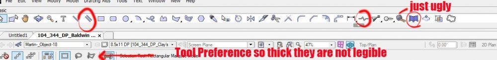
I just wish the PC side of things was paid attention to, luckily I don't find the tools as I use hot keys to do that unless it is a tool I don't use very often. Some of the icons simply don't look like what they are intended for. See circled below.
I also hate to say it but it looks embarrassing when compared to other CAD programs, That means a lot when a client/ producer look at the program you are working on and judge your abilities based on what the UI look like. And it does happen.
-
1
-
![2020-06-03 17_18_40-Vectorworks Designer 2020 - [_MDF Drafting Blank 2020.vwx].jpg](https://forum.vectorworks.net/uploads/monthly_2020_06/1750552257_2020-06-0317_18_40-VectorworksDesigner2020-_MDFDraftingBlank2020_vwx.jpg.7fa60bb8add2f353f517cf68d4938bce.jpg)


Objects in resource manager behavior
in Troubleshooting
Posted
I have a moldings resource manager. Some I double click then on the third click I can place the resource in the drawing. Others I double click and Vworks places it seemingly randomly on the design layer. My question is there any way to edit the properties of placing a resource object on the design layer?