


Taproot
-
Posts
516 -
Joined
-
Last visited
Content Type
Profiles
Forums
Events
Articles
Marionette
Store
Everything posted by Taproot
-
Clever!
-
It's been a while since I set up our titleblock, but I recall that using multiple fonts was problematic. I ended up converting fonts to polylines to keep their appearance correct. So - multiple font support. Page margins and titleblocks are an on-going challenge for us. We typically work on 24x36 size pages, but print check sets on 11x17 at 50%. Our page margins are set up to accommodate the difference in paper size. Whether we are printing at 100% or 50%, we would prefer to have the pdf scale from the center of the right hand side. Currently, it scales from the center / middle of the drawing. Our work around is to insert a loci in the titleblock symbol for check sets and then delete it once we get to construction drawings (so that the titleblock slides right to the edge of the page). It's not an elegant solution. See Graphic. I think the best solution would be to add the ability to scale pages in the "Publish>Options" window and then be able to control from which point the sheets are scaled i.e. eight choices including page corners and centers of each side. So, while this isn't a direct change to the titleblock settings, the issue seems best brought up here.
-
There is no way that I know of. If you're hatch idea works - let us know.
-
I'm pretty sure this was a bug fixed in service pack 2 (2017). I can do it now (Mac - El Capitan).
-

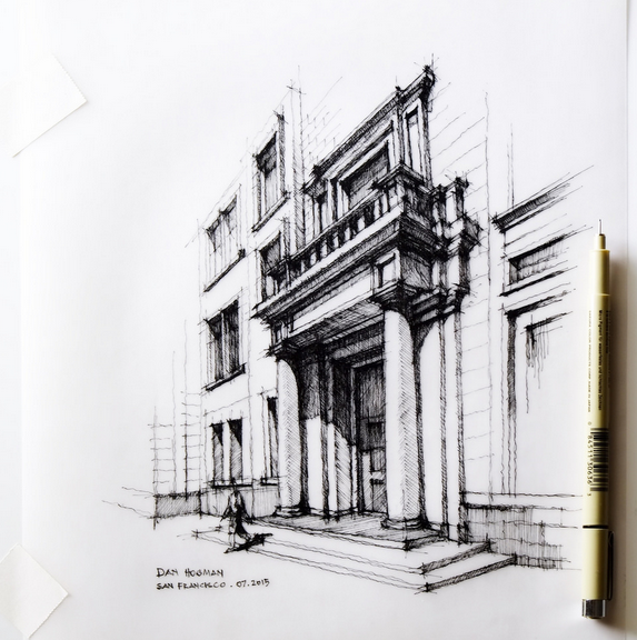
Improve Pencil (Sketch) Rendering
Taproot replied to Taproot's question in Wishlist - Feature and Content Requests
Yes, your example is slightly better than the one I posted, but it is still hindered by the way in which VW renders lines. The example pane in the dialog box shows the issue well. Lines seem to either taper from one end to the other, or be thin on the ends and thick in the middle. Heavier endpoints and thinner mid-lines tend to look better. One of my classmates from college had a beautiful hand using this technique. While I don't have time to track down nuanced examples, here's a few that illustrate the character of this technique.
-
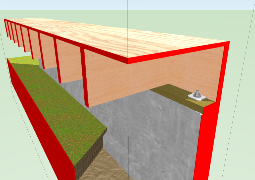
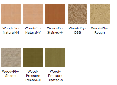
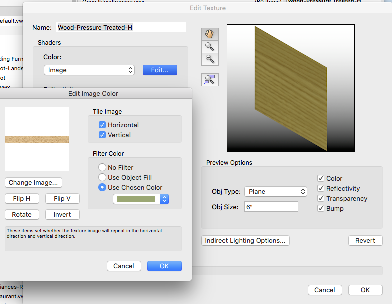
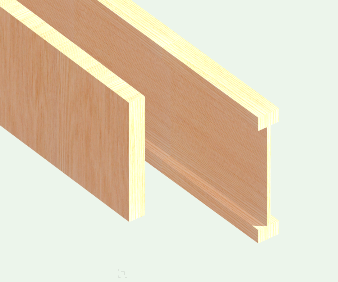
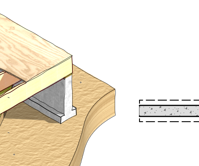
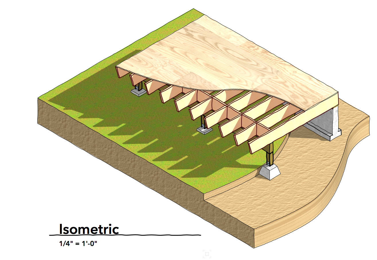
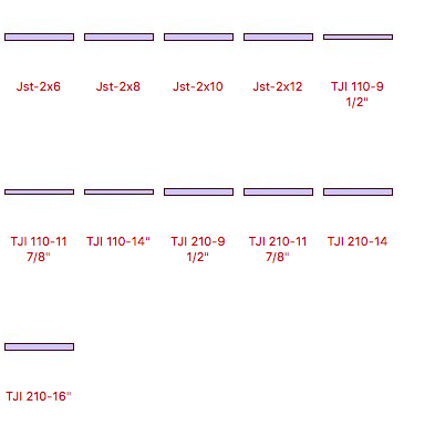
Here's some tips and resources to help you with your framing drawings. Textures Here in the Northwest, we use fir for most of our framing. After spending some time searching for a suitable texture, I finally just scanned a block of wood from my shop ... Sometimes it's easier to make what you need than to find it. I've found that light textures are often the best - as you can add pigment to change their appearance. To do this, edit the texture and "Use Chosen Color" to alter its appearance. For example, my Pressure Treated texture is just a green color applied to a standard wood grain. See Graphic. Texture Orientation The textures for framing members are counter intuitive. I can never remember which orientation is appropriate for which framing member. The best solution that I've found is to create two copies of each wood texture (one horizontal and one vertical). You can then apply the one best suited to the object - Post, joist, etc.. Here's an example: The solid-sawn joist and the I-joist pictured below both have the same texture applied. As you can see, they go in opposite directions. Here's the most common textures that I use: Natural wood, Stained (oiled) wood, Ply, OSB, and PT lumber. I'll include a file with these at the end of this post for you to use. Note - I named the orientation backwards from the image as an attempt to guide my selection to what would display correctly (most frequently). Drawing Posts / Piers I've tried using extrudes and walls for posts. Walls can be useful if you are fitting objects to something, but in general - I prefer to use the floor object. Floor objects give you the ability to texture the faces differently. It allows you to control the height in the OIP. You can also create an “X” within the plan view rectangle by editing the floor polygon and adding two lines. The perimeter rectangle and the "X" can be different line weights. This doesn't effect the 3D rendering of the object and will resize with the rectangle to create different member sizes. Use Class Overrides Wall footings are a good example. I place my footings in a class with dashed line attributes when viewed in plan. For viewports where footings are visible in 3D, I override the class in that viewport to show lines as solid. The same technique can be done for framing. This graphic shows the same footing in both plan and isometric views. 3D Hardware Sometime ago, I converted the Simpson Strong Tie catalog to VW objects. You can download them here and extrude the 2d geometry into whatever shapes you need. By now, there may be a simpler way to do it as well. Setup Standard Framing Symbols In my template, I've set up folders with settings for joists and I-joists. That way, I don't need to remember what the flange width on a 14" TJI I-joist is .... I can just select it and start drawings. That ensures accuracy and I only have to do it once. Texture File Attached in v2017 and v2012 Framing Textures.vwx Framing Textures v2012.vwx
-
Improve Pencil (Sketch) Rendering
Taproot posted a question in Wishlist - Feature and Content Requests
Hand drawn architectural drawings typically look better when the endpoints of lines are heavier than the midpoint of the line. It gives the eye a terminus to shapes and the varying line width adds an artistic element to the drawing. Sketchup has figured this out and implemented it in their standard rendering, but for some reason the implementation in Vectorworks is different. I'm referring to the "pencil" and "pen" options in the Artistic Renderworks settings. Lines seems to randomly migrate between thick and thin (based upon an algorithm?) rather than follow the geometry of the shapes. I think lines with heavier end points and lighter mid-line weights would be a substantial improvement over what is available now. Here's an example from Sketchup and another from Vectorworks:

-
Custom Title Block - Multi-Line Text Fields Don't Automatically Wrap
Taproot replied to rDesign's question in Known Issues
Yes - this issue has been a nuisance for me as well. The 'wrap text' feature not working should be added to the bug list. -
Christian, If you select a light object and look at the OIP, you'll see the "cast shadows" setting. I have this 'on' for one light and 'off' for the second light in the pair. As mentioned above, I place all of my light pairs on one layer "lights" and each pair on a different class. For example, I have the lights themselves in the "none" class. Then, I group them into pairs and change the class of the group to class>"lights-bottom" (top, left, right...). That way, I can turn all of the lights off (by hiding the layer). This is useful when I'm working on the model and I just want the generic VW lighting to illuminate the model. Then, when setting up the viewports for presentation, I turn on the lighting layer and only the light class appropriate to the orientation that is being displayed. If you have multiple lighting pairs (classes) on in a viewport, it will overexpose the rendering and give it a washed out appearance. It might look good as 'Pop-Art', but it will be hard to read. Here's a screen shot for reference.

-
That's strange, the forum ate my post ... So in brief lest it shows up again I'm glad you solved the problem. Publish is located under the File menu. It will allow you to select sheets and order them to your liking for export to a pdf (or a number of other file formats). You can print a whole set of drawings (into one PDF) and then save the set for recall later. It sounds like you've got the gist of a good workflow. When you save the file, it will save all of your design layers and sheet layers. You can go between them at any time, so you don't need to print out each sheet as you go. Most people (I think) wait until the drawings are complete and then print out the entire set at once.
-
I assume that you are using the "publish" feature to export the set. As a work around, you could also try printing each sheet individually as a PDF. I've found that when one method is broken, the other often will work. You can also try closing and restarting VW. Sometimes nuisance bugs are cleared out by that simple old-school solution. Some other ideas ... no idea if they will work but (save your file first): 1. Copy the working titleblock and go to the sheets that aren't displaying it properly. One at a time, delete them and paste in the working titleblock. It should retain all of the data specific to that sheet. 2. Edit the working titleblock with some trivial change - add a space to the end of a name (for instance) and under the Project Tab, select "Apply ... to all" 3. If none of these work, call tech support.
-
It may be that the container class is "none", but the objects making up the symbol are probably in another class that is hidden in your viewports. Try editing the symbol and see what classes the objects are on - then turn those classes on in your viewport visibility.
- 7 replies
-
- 1
-

-
- viewport
- sheet layer
- (and 1 more)
-
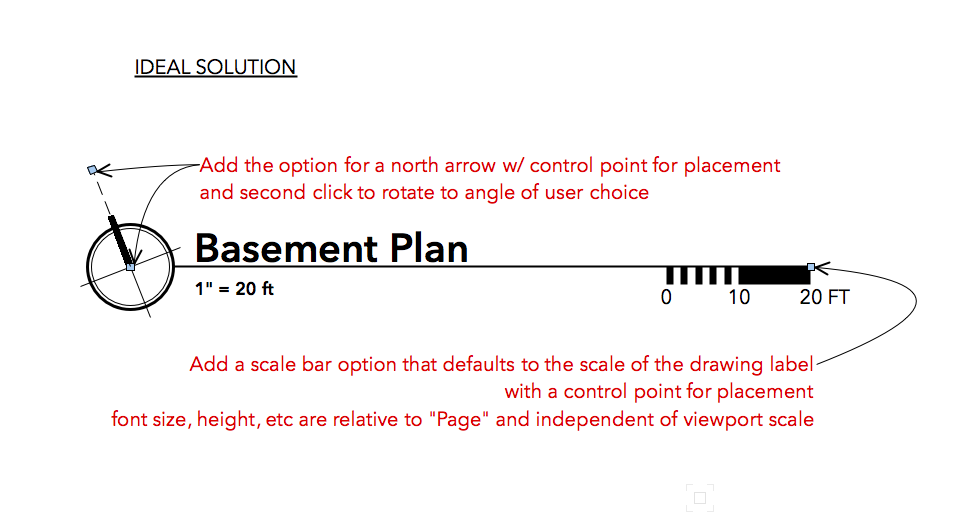
I'm not sure exactly how to move a post from another forum here, so I'll include a link below. I would like to see better integration of the scale bar and north (directional) arrow into the drawing label tool. These three items go together on most drawings - so having a simple way to include them as part of the plug would be a solid improvement. Thanks.
-
Elliptical Walls - can we really not do this?
Taproot replied to Tom Klaber's question in Wishlist - Feature and Content Requests
Tom - we just battled this issue on a project. The design is based on a turtle (Hawaii), so we used an ellipse as the base geometry. Ultimately the best solution was to use round wall segments AND an extruded exterior shell. The segments worked fine in plan and section, but the elevations were terrible. It meant subtracting solids wherever there was an opening, but the result worked pretty well.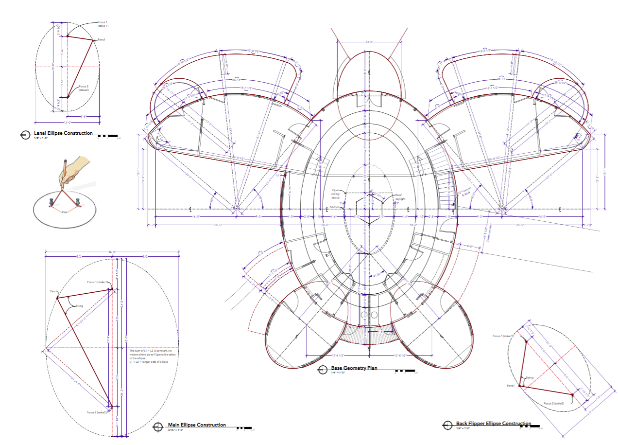
-
I suspect that is a wishlist item ... If you're willing to consider an alternate method, you could probably get similar results. Rather than trying to store your master list of classes in a worksheet, consider storing them in a dedicated file. You can then use the Tools>Organize>Classes [Tab] >New [Button]>"Import Classes">"Choose" That will allow you to import any combination of your custom classes from your template file into a working file. Then - if you evolve a class definition in the new file and want to update the template... You can do the same process in reverse. It's not as simple as you described, but may meet your needs.
-
Yes you can make a worksheet with all of the classes in a file, along with their properties, etc. I managed to do it some time ago to help me visualize the mapping. Unfortunately, I can't remember how I did it, but Pat offers some guidance in this thread from a while ago. See below. I've included a blank file with worksheets for VW's standard naming (Classes and Layers). It may not be entirely up to date, but it should show you what is possible ... and maybe get you to where you need to go. Classes & Layers.vwx
-
That method may cause you trouble later. If you have one keynote linked to a number on the list and another that is just static text, they could get disassociated from one another. For example if the keynote list gets re-sorted, or you end up deleting a keynote earlier in the list. What I typically do in this situation is: Option drag the keynote i.e. #4. That will create a copy that you can re-position on the drawing, but it will maintain its link to the keynote list. If you ever need to change the note text, go into the note manager and change it there (not the OIP). It will update all of the copies on the drawing. The copies will be summed (borrowing a term from the worksheet behavior), so they will only show up in the keynote list once.
-
Another idea would be to model a portion of the pattern as a symbol and then repeat in an array over the area you want to cover. That would give you crisp geometry that would be fairly easy to modify if the design evolves.
-
Yes - this strategy is really just a workaround. I have my fingers crossed that the navigation pallet will follow the lead of the resource manager.
-
Some time ago I was looking for a dependable way to light elevation views that would be easy to embed in my template file and use from project to project. The system that I came up with has served me quite well for a long time. If you have a primary light or even a primary and secondary light in your model, you'll find that elevation views will look great on the side the lights are oriented to. I'll arbitrarily call that the "front." The sides will look OK, but not great and the back will be almost entirely in shade. My strategy is to create pairs of lights. Each pair contains one that casts shadows and one fill light that does not. I then class each of the light pairs into: Lights-bottom, Lights-top, Lights-left and Lights-right. By using page orientation rather than compass direction, I find it's easier to remember which one to use relative to the plan when assigning them to viewports. I place all of the light pairs on a "Lights" design layer. That allows me to turn them all on or off together or individually. This strategy isn't true to solar orientation, but rather is designed to help the drawings read better. Here's a view of the lights and some elevations that use this technique.
-
Right out of the box, VW's layer organization can be a little hard on the eyes. As mine have aged, I've looked for ways to intuitively break down the long continuous list in the Navigation Pallet into smaller chunks that are easier to navigate between. The strategy that I've used is to create a series of empty layers with titles that are either made up of spaces or dashes. Be aware that VW won't allow more than one layer with the same title, so you'll need to use a different number of characters for each divider. This strategy can be used on both the design and sheet layers. Placement can be controlled using the # column in the pallet - allowing for manual placement of the visual breaks wherever you want them.
-
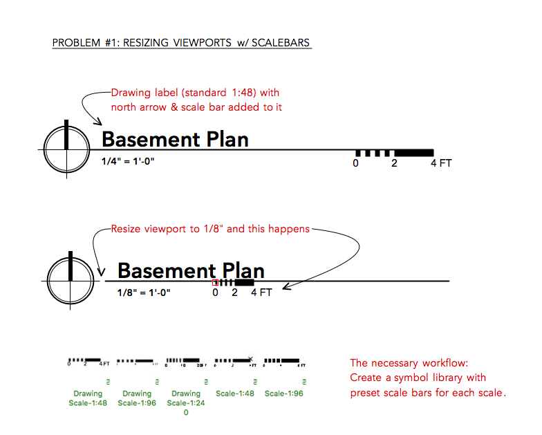
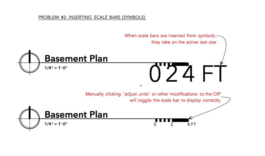
Hi Pat, I think I misled you with "Drawing Title" - after looking it up, the correct term is "Drawing Label." I can see why you thought adding a scale bar to the title block might seem a little strange. Instead, I was referring to the typical convention of adding a scale bar to drawing labels to verify scale when drawings are reproduced or resized. While I've tried to create a symbol that combines the drawing label and the scale bar, I've found that the two don't play very well together. The drawing label works well as a symbol, but the scale moves around and distorts when placed in different scaled viewports. Therefore, a different symbol is necessary for every scale used in the drawing. I've included a few images of some of the problems that I've run into. So, with a little more thought, this is probably a better fit for the "wishlist topic:" Can we have a drawing label that includes the capacity for north arrows and scale bars in one object please? Graphics below.
-
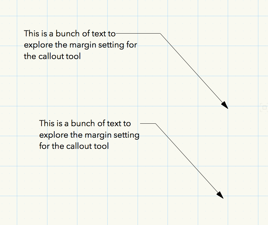
Hmm. I'm not seeing that behavior on my version. You can try checking the "extend shoulder" option in the OIP which will extend the line to meet the text. Or, you could try reducing the "Max text width" to see if that will pull the text block closer to the leader. By default, mine appears to display properly. Here's two examples. One with extend shoulder (top) and the other just "normal."
-
After all of these years, why hasn't the scale bar been integrated into the Drawing Title? In my experience these two are almost always used together.
-
Andy - That's a great resource. Thanks for sharing. The elevations are grayscale textures. I find they read best for construction drawings. They give enough texture for shadows to read correctly but aren't too saturated to overwhelm the rest of the information. Another plus is that you can modify the texture with a color overlay to try different finishes. ---- One idea I've speculated about for linking content is to be able to embed hyperlinks directly into symbols. Imagine being able to click on the bathtub and having it link to the manufacturer rough-in sheet, or embed links into worksheet text so that clicking on a scheduled item would take you directly to the manufacturer product literature...